Dr. Maggie Klotz needed a brand that felt like a true reflection of her values and the clients she serves. In a saturated counseling market, she wanted an identity that stood out without feeling loud, and communicated inclusivity, warmth, and trust from the very first interaction.
I led a full rebrand, including developing a logo and visual system, then extending it into a calm, intuitive website that supports clients as they begin their care journey.
The Challenge
Mental-health services often come with a lot of emotional weight, so the brand needed to strike the right balance: comforting but not cliché, professional but not clinical, modern but not trendy. The identity also needed to speak to a broad audience, many of whom might be reaching out during stressful or vulnerable moments.
The Game Plan
1. Designing a logo and brand system that communicates support, stability, and openness
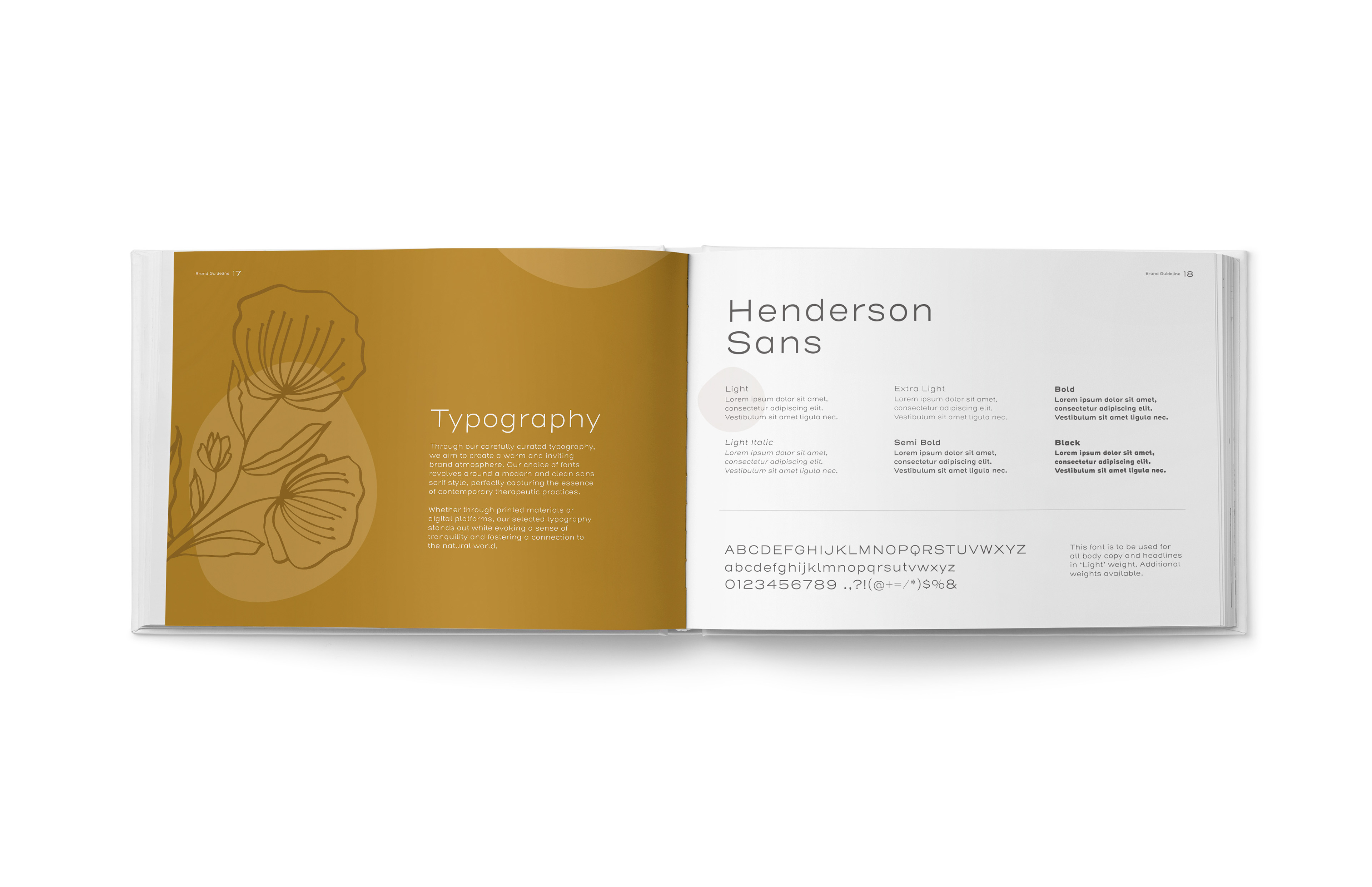
2. Creating a color palette and typography system that feels calm and approachable
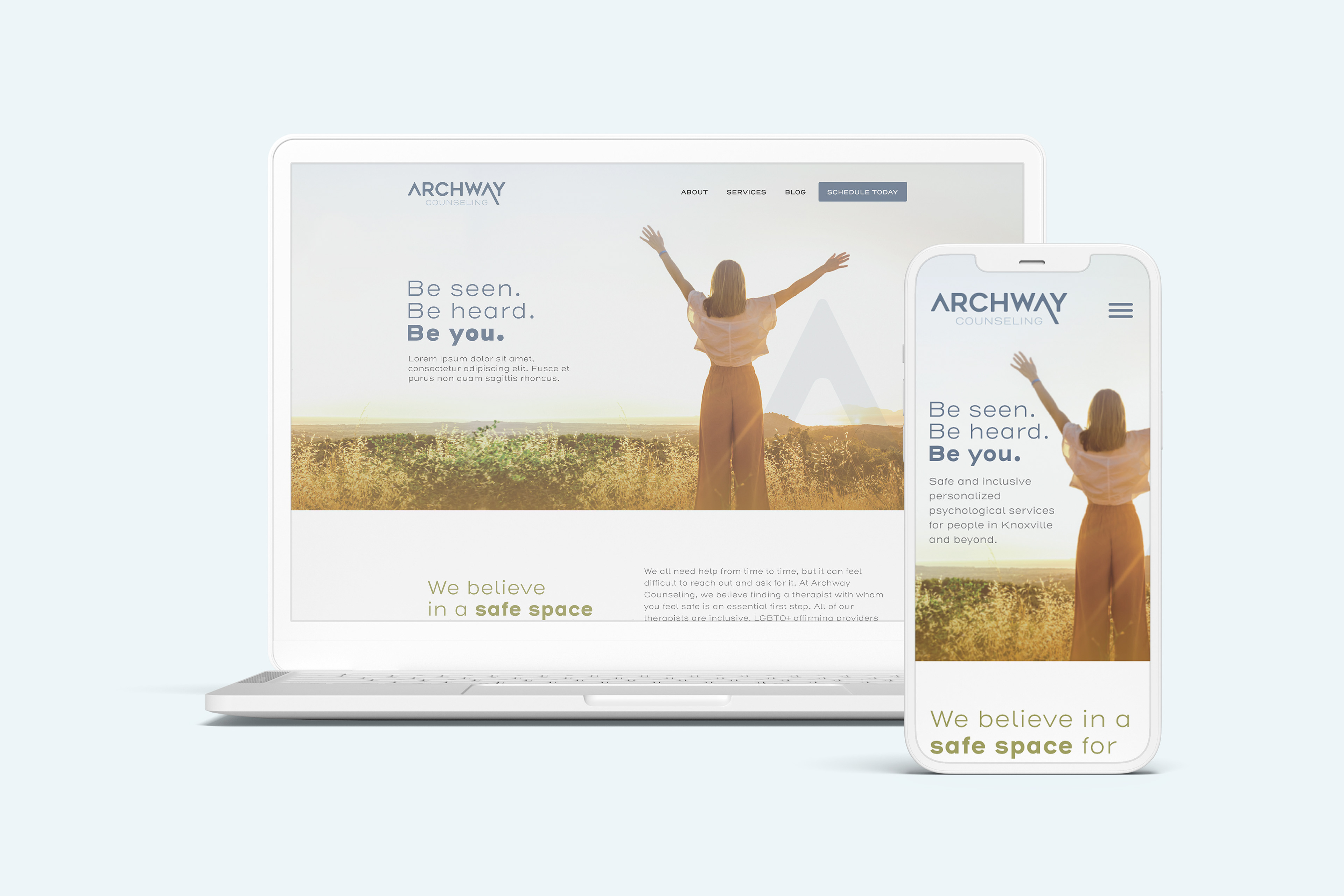
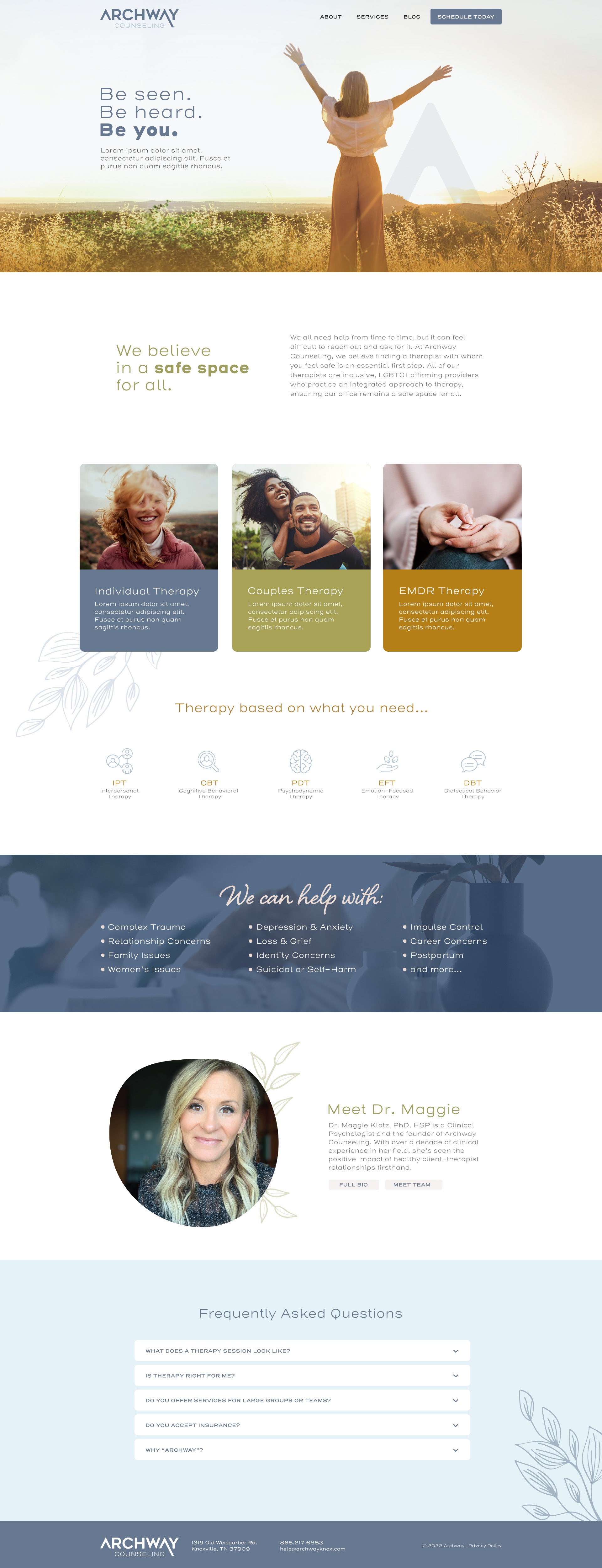
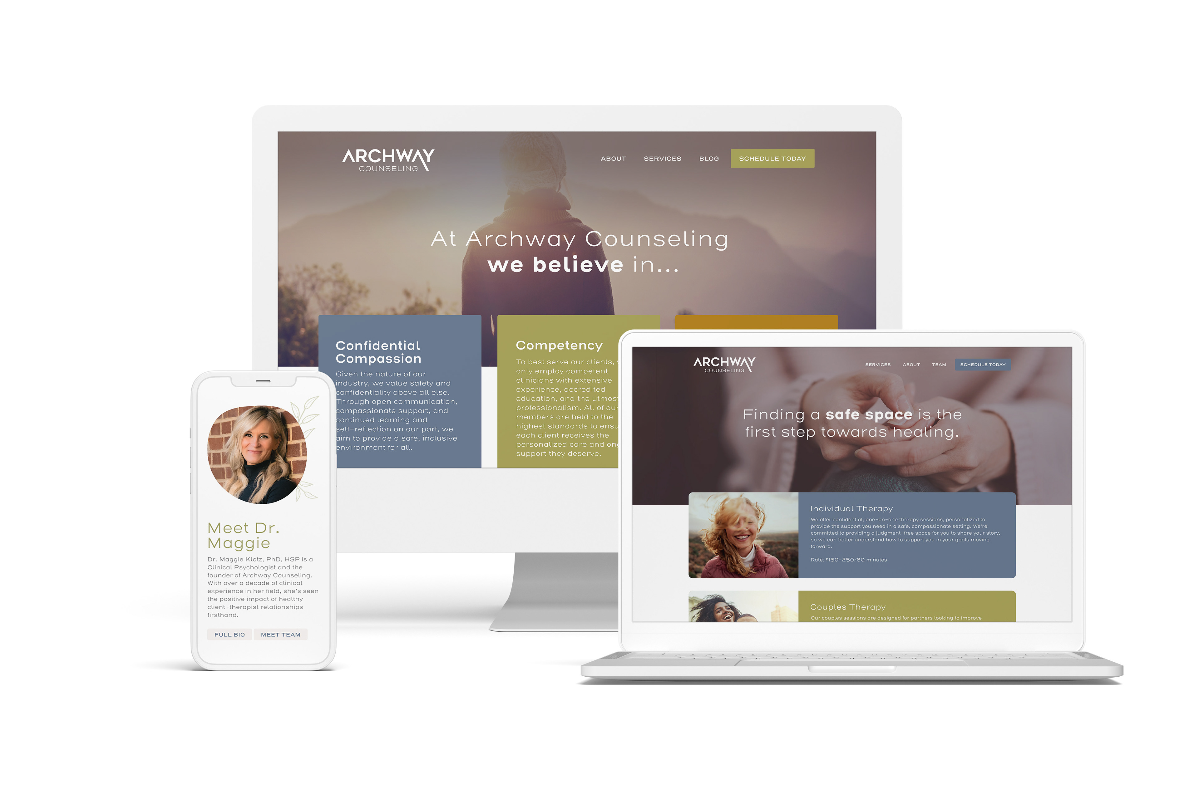
3. Building a clean, intuitive website that’s easy to navigate and reduces friction for new clients
4. Ensuring the brand feels human and trustworthy across every touchpoint
The Brainstorm
I explored how wellness and counseling brands use visual cues to create emotional comfort and trust. The goal was to borrow from that language without slipping into generic “healthcare teal” territory.
I pulled in warm neutrals, soft gradients, and rounded type to create a sense of warmth and accessibility while keeping the design modern, crisp, and unique.
The Work
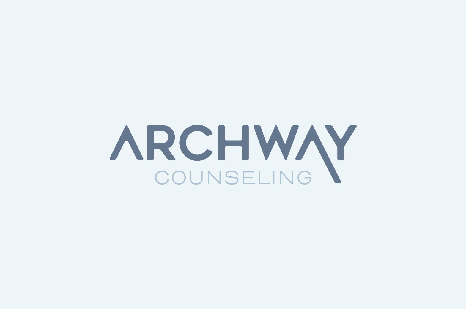
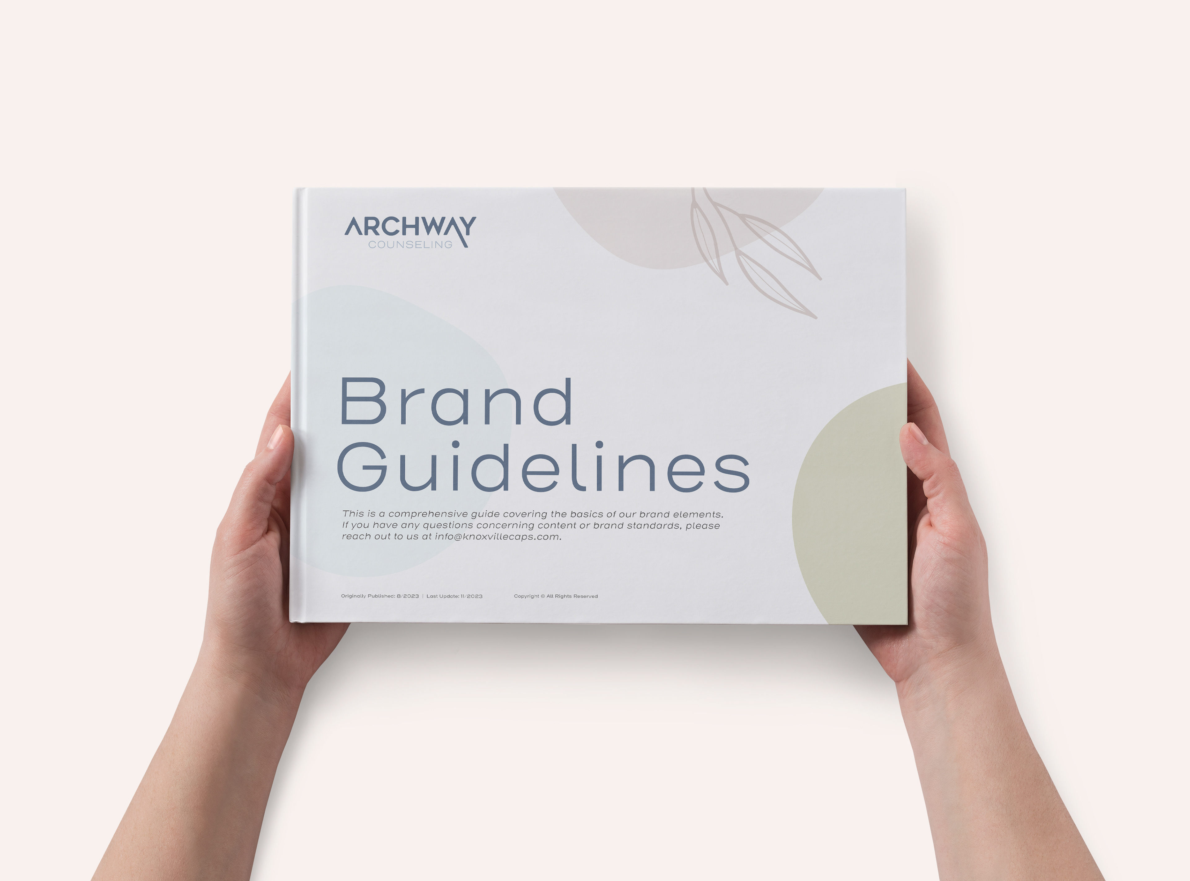
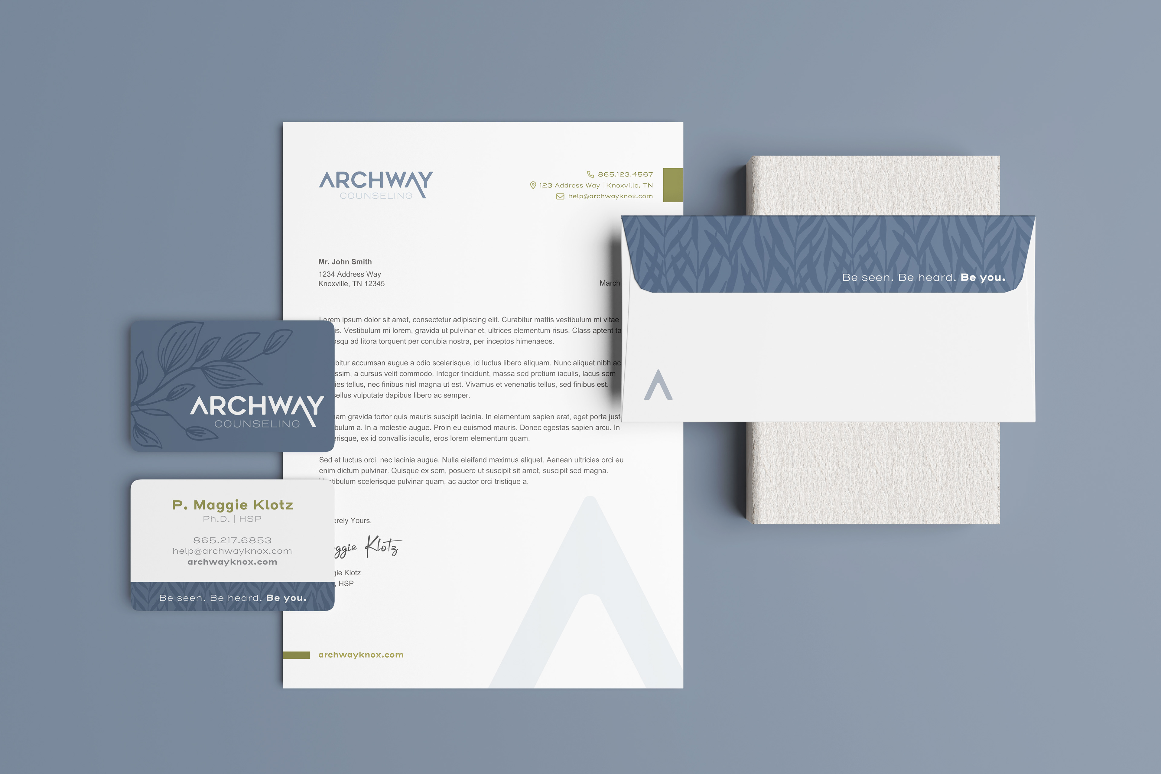
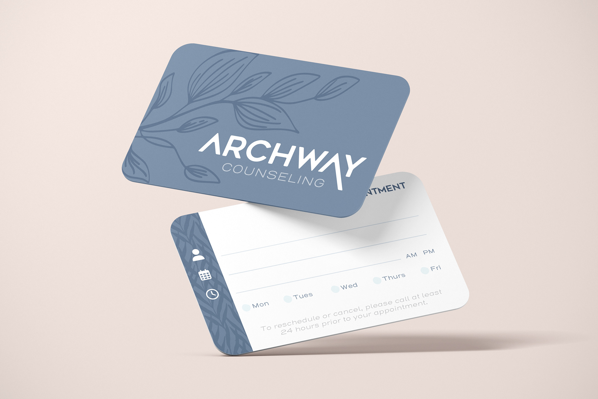
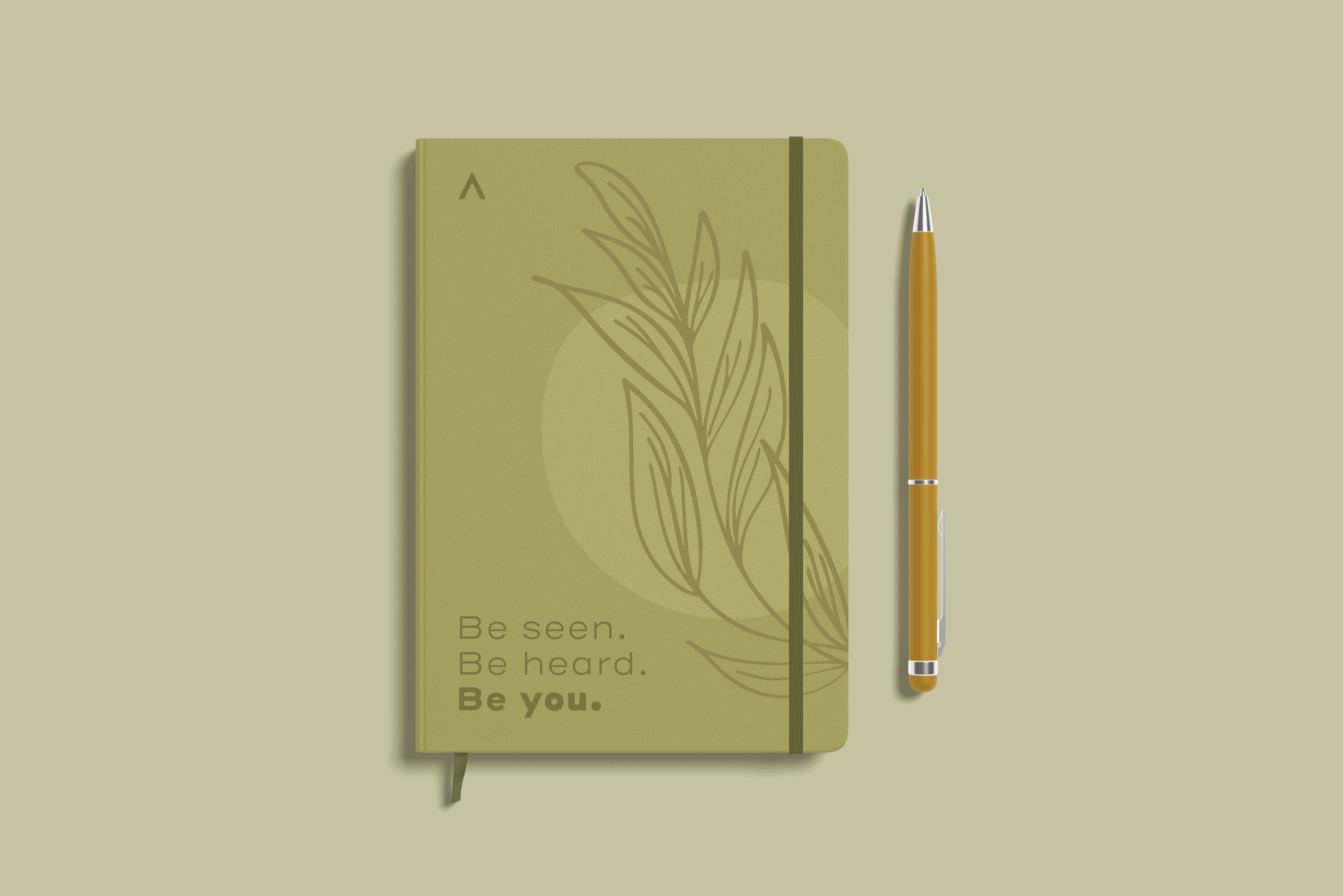
Logo Development: I explored symbol-driven marks that communicate guidance, stability, and forward movement. The chosen logo uses a simple arch shape — a visual metaphor for support and transition — paired with clean, approachable typography. It’s flexible enough to work across digital, print, and signage.
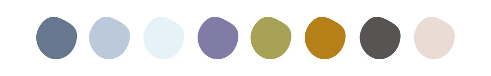
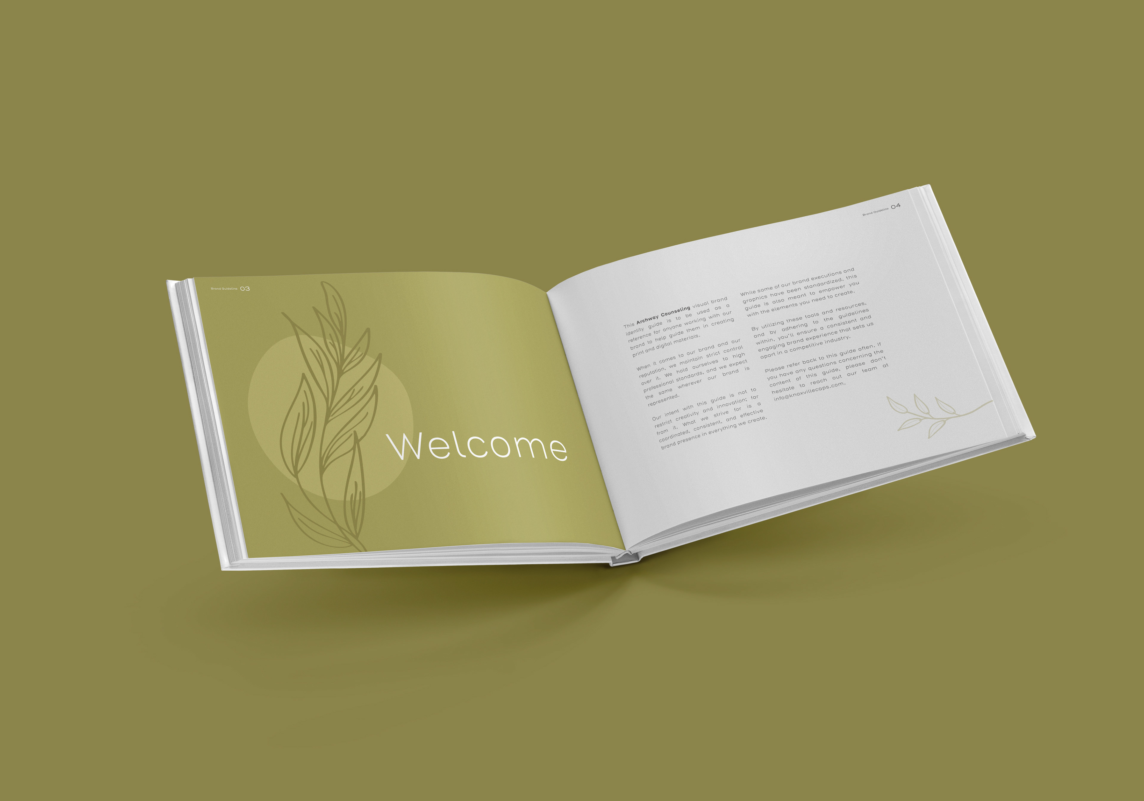
Brand System: The palette uses warm earth tones and gentle blues to create an inviting mood. Typography blends modern structure with a soft, human feel. I incorporated a mix of imperfect, organic shapes as a nod to individuality and the idea that no one’s path is perfectly linear. The soft foliage elements layer in a sense of tranquility and growth, reinforcing the supportive environment the practice aims to create.
Website: For the site, I focused on creating a calm, clear layout where users can quickly find what they need — whether that’s learning about services, meeting the therapists, or getting in touch. The design uses generous spacing, clear calls to action, and warm visuals to make the experience feel welcoming and low-pressure.
Collaboration: During the process I worked alongside their copywriter to ensure the brand collateral and site worked smoothly together and carried the same tone throughout.
The Afterglow
The final identity gave Archway Counseling a modern, welcoming presence that reflects the supportive, open care they provide. The brand feels grounded and trustworthy without being overly clinical — a look that makes clients feel more comfortable reaching out for help.
Some of the work featured on this page was developed while I was employed at Asen Marketing, where I contributed to client projects and brand initiatives as a Senior Designer & Developer.