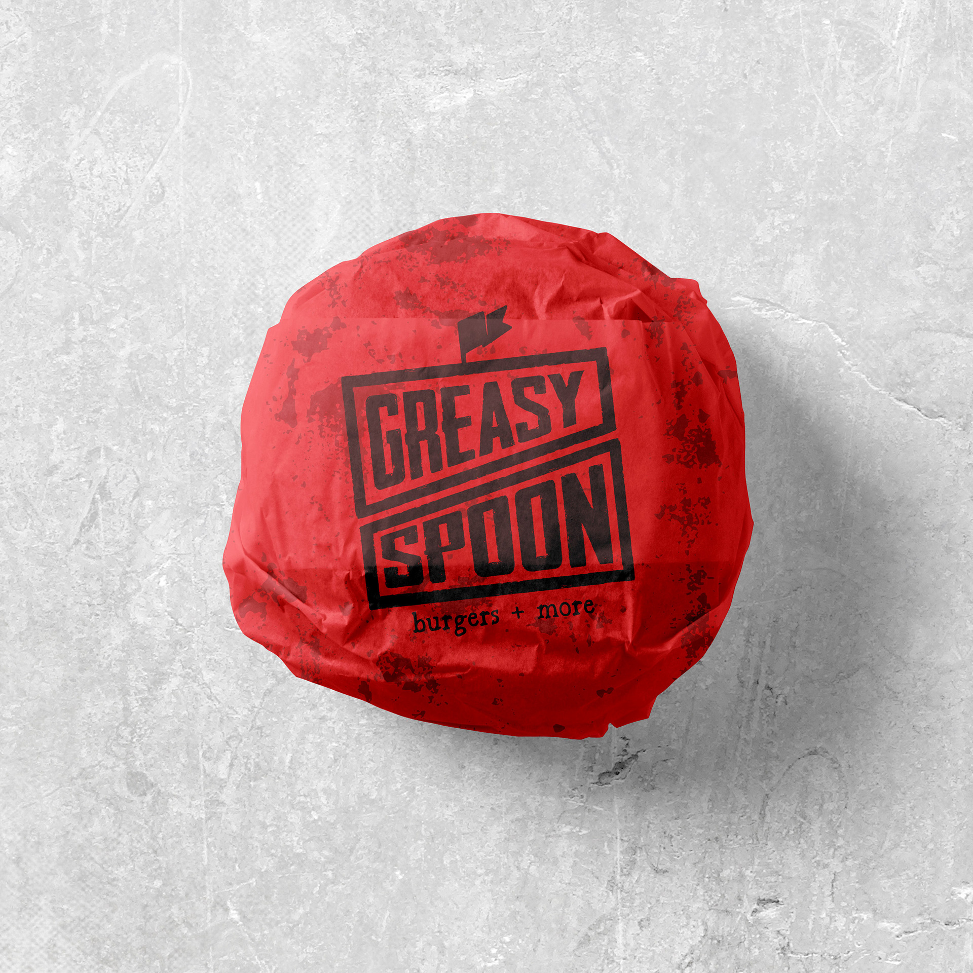
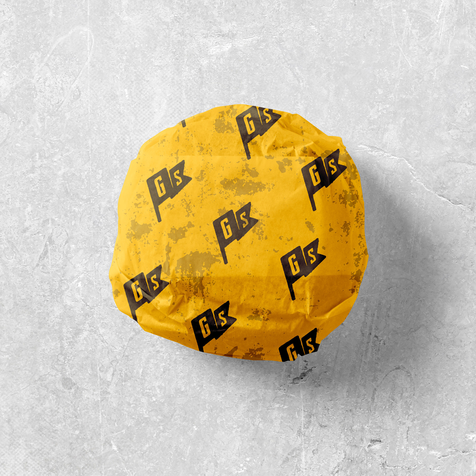
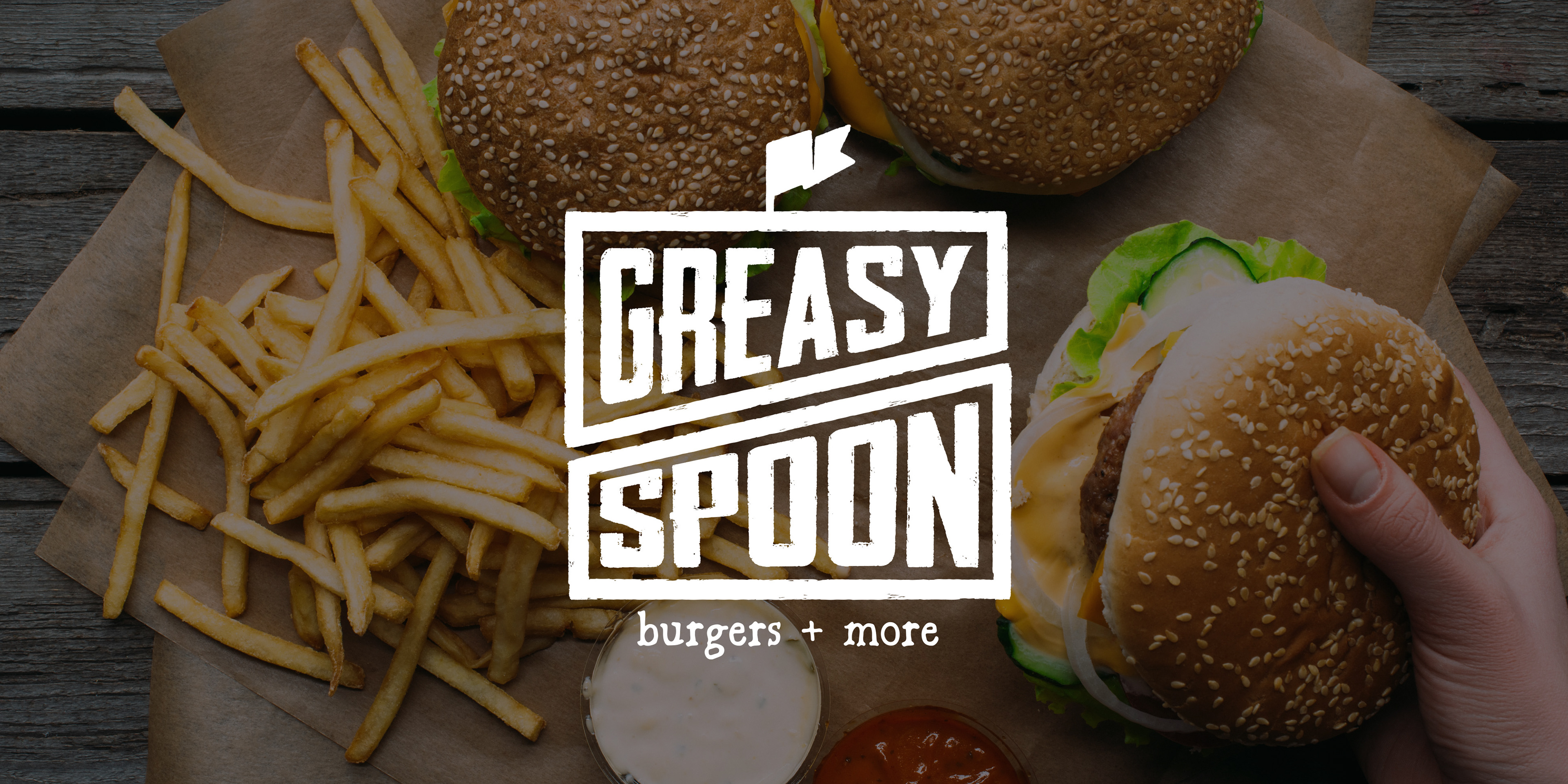
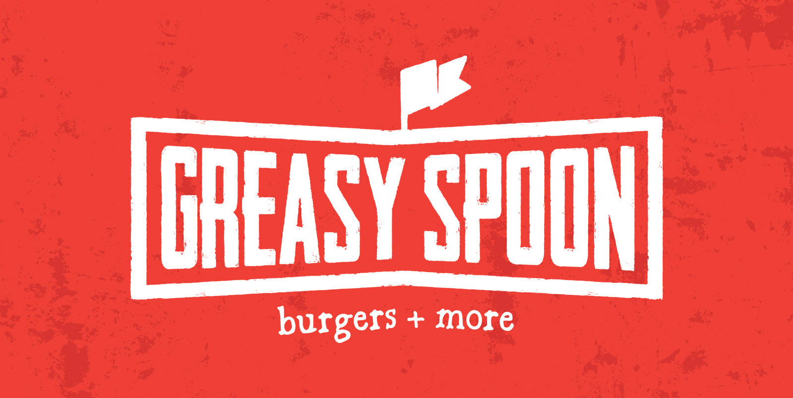
Greasy Spoon is a grab-n-go restaurant concept in the Smoky Mountains, serving smash burgers, hot dogs, fries, and other comfort-food staples. The owners wanted the brand to feel fun, hip, and a little grungy, with a playful nod to burger culture. I led the full creative process — from logo development to menu design — creating a cohesive brand identity ready to launch.
The Challenge
Starting fresh meant building the brand from the ground up. The team had a strong vision for the food and the vibe, but no visuals yet. The challenge was to create a look that was approachable and energetic, with a little grunge edge to match the casual, unfussy spirit of the restaurant.
The identity needed to work across everything from signage and menus to potential merch, making the brand instantly memorable and scalable.
The Game Plan
1. Establish a distinct, personality‑driven brand that feels fun and bold.
2. Develop a logo system that nods to burger culture without being cliché.
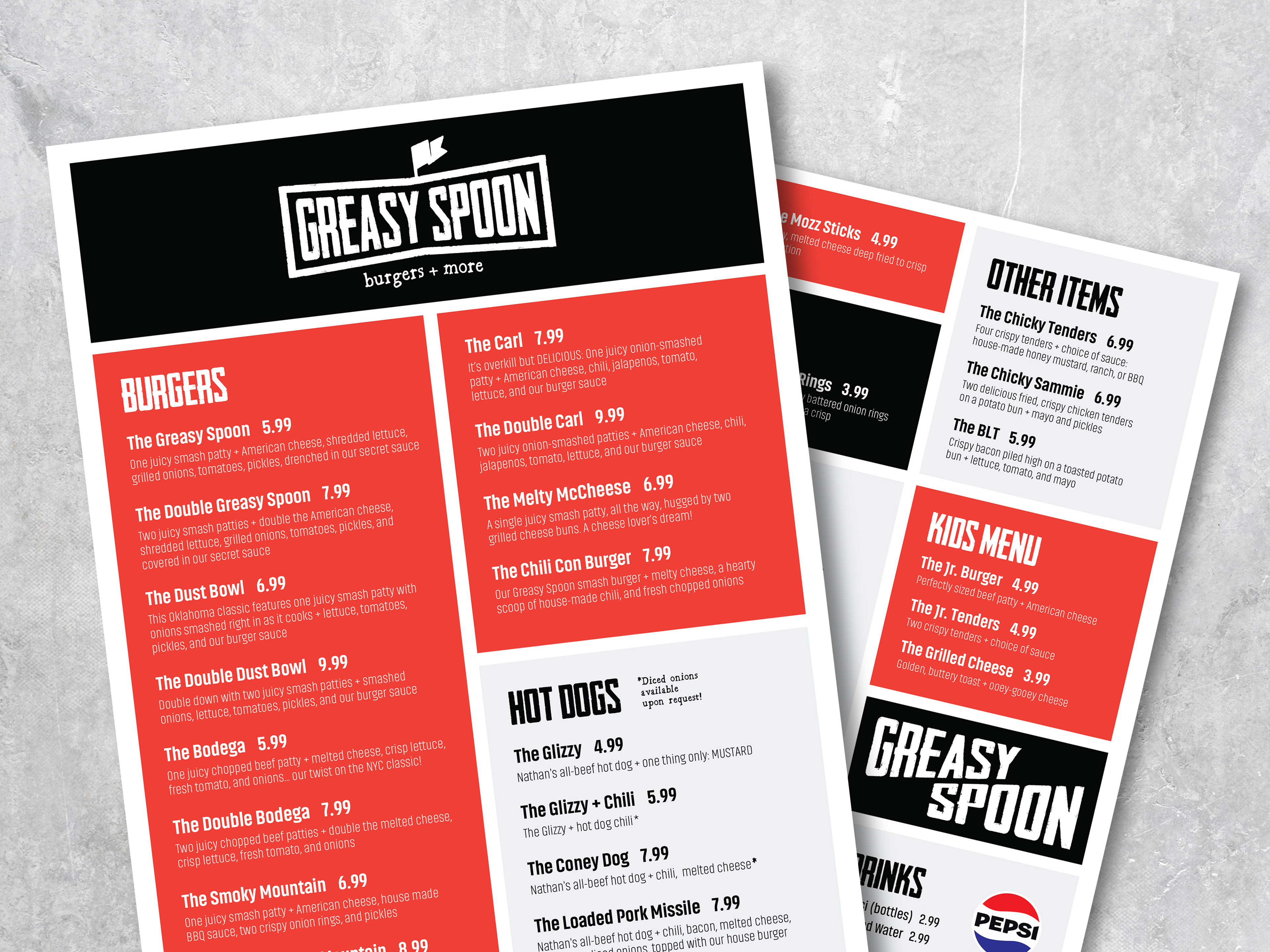
3. Design menus that are easy to navigate at a quick-service pace but still visually fun.
4. Build a foundation the restaurant can expand on as they grow to keep things easy and consistent.
The Brainstorm
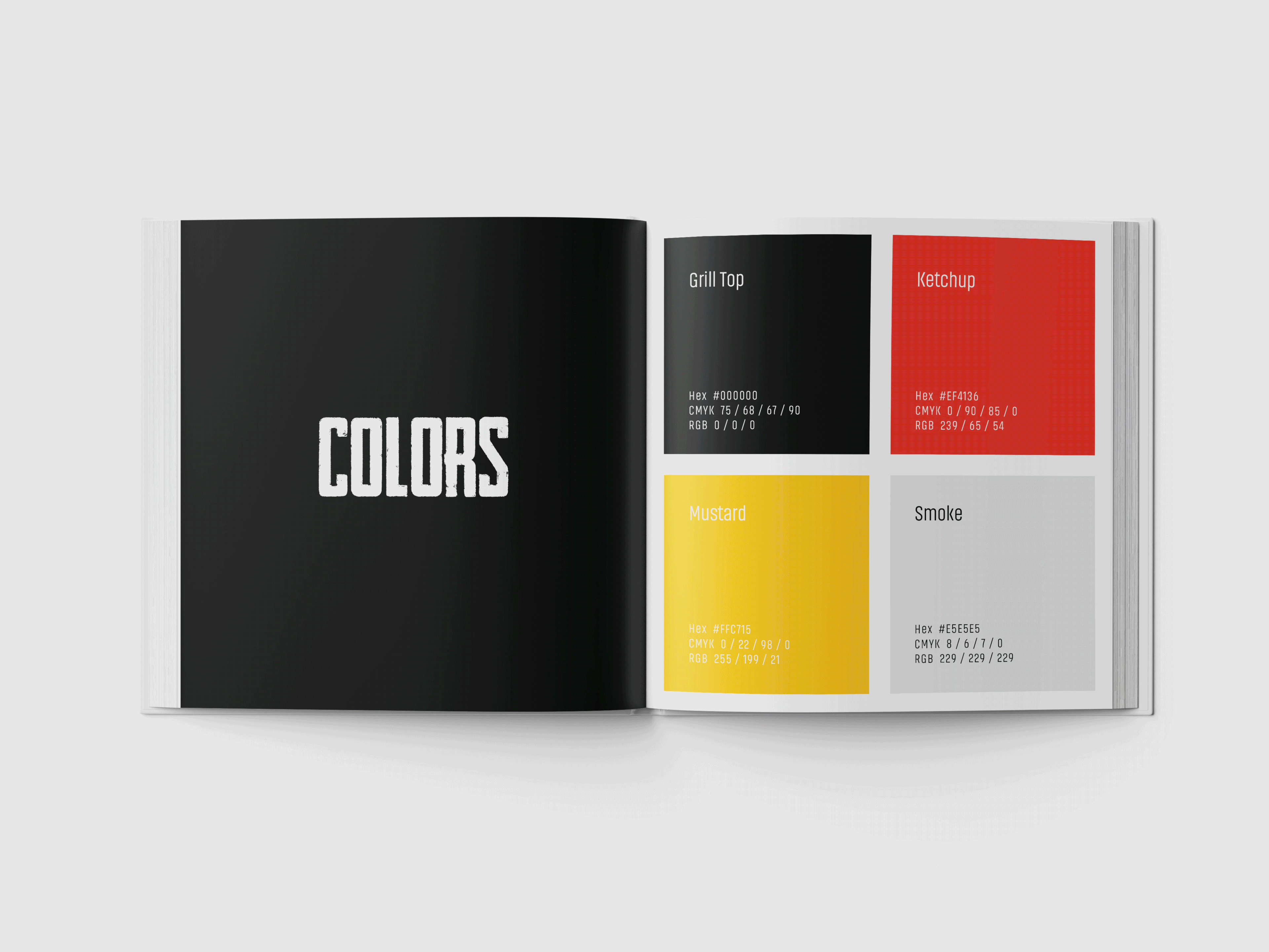
To anchor the brand direction, I dug into the visual world of casual American food culture, local competitors and how they were positioning themselves, and the textures, palettes, and typography that could evoke a grunge-meets-approachable personality. The insight that drove the direction: customers love brands that feel a little rough around the edges but intentional — the kind that entice before you even see the food.
The Work
Exploration: I started with a mix of sketches and quick digital iterations, playing with burger silhouettes, type stacks, and gritty textures. I leaned into imperfect lines and tactile details to give the brand its “Greasy Spoon” personality without slipping into novelty.
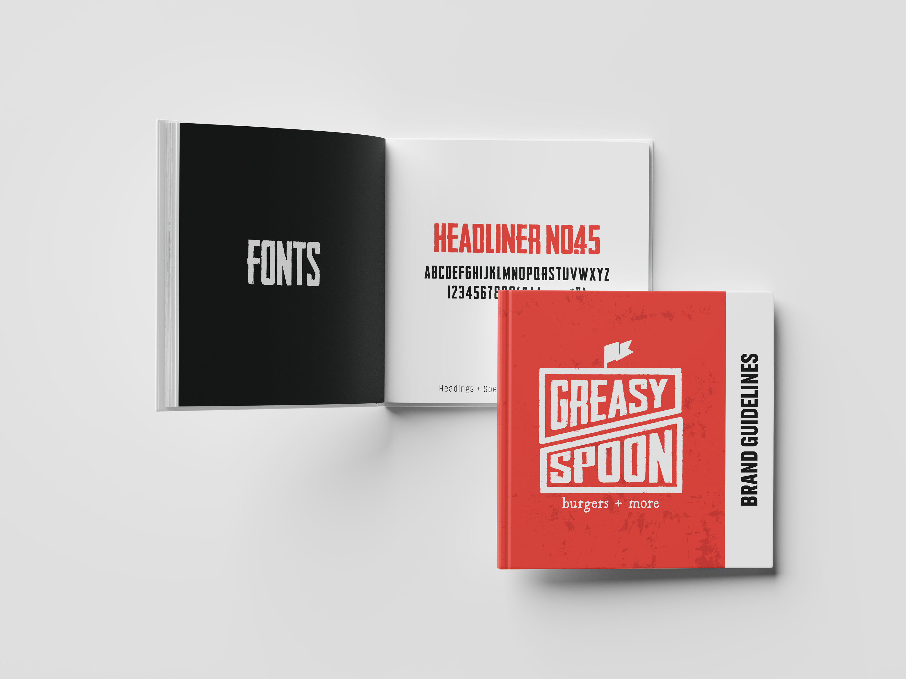
Logo Development: Several concepts explored the balance between playful and bold. We narrowed in on a mark that felt iconic enough to stand alone but flexible enough to work in a full lockup.
Menu System: Once the identity was nailed down, I built out menu layouts that matched the brand’s tone — bold headings, clear item hierarchy, and enough expressive elements to keep things fun and distinctive.
At each stage, the client and I stayed closely aligned on tone and energy, refining details until the full system clicked.
The Afterglow
As a brand-new restaurant, the goal was to launch with a clear personality that locals and tourists would immediately connect with. The owners loved how the identity captured their vision and gave the restaurant a distinct presence from day one.