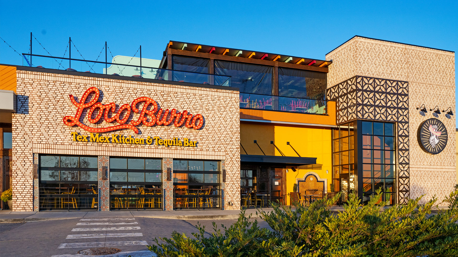
Loco Burro is a vibrant Mexican cantina and rooftop bar bringing fresh Tex‑Mex flavors and lively atmosphere to Knoxville. When they decided to open a new location, they partnered with the team at Asen Marketing to elevate the brand, leaning into a colorful, energetic identity that reflects the food, fun, and casual spirit of the restaurant experience.
I was responsible for shaping the logo, menus, and supporting brand materials, working directly with the client from early concepts through final production.
The Challenge
Loco Burro already had name recognition and a strong vibe in the tourism market of the Smokies, but the Knoxville concept needed a look and feel that could hold its own in a more competitive local scene. The goal was to create an identity that felt fresh, welcoming, and true to the lively Tex‑Mex experience.
The Game Plan
1. Create a brand identity that feels fun and flavorful, just like the items on the menu.
2. Design a logo that balances bold personality with versatility.
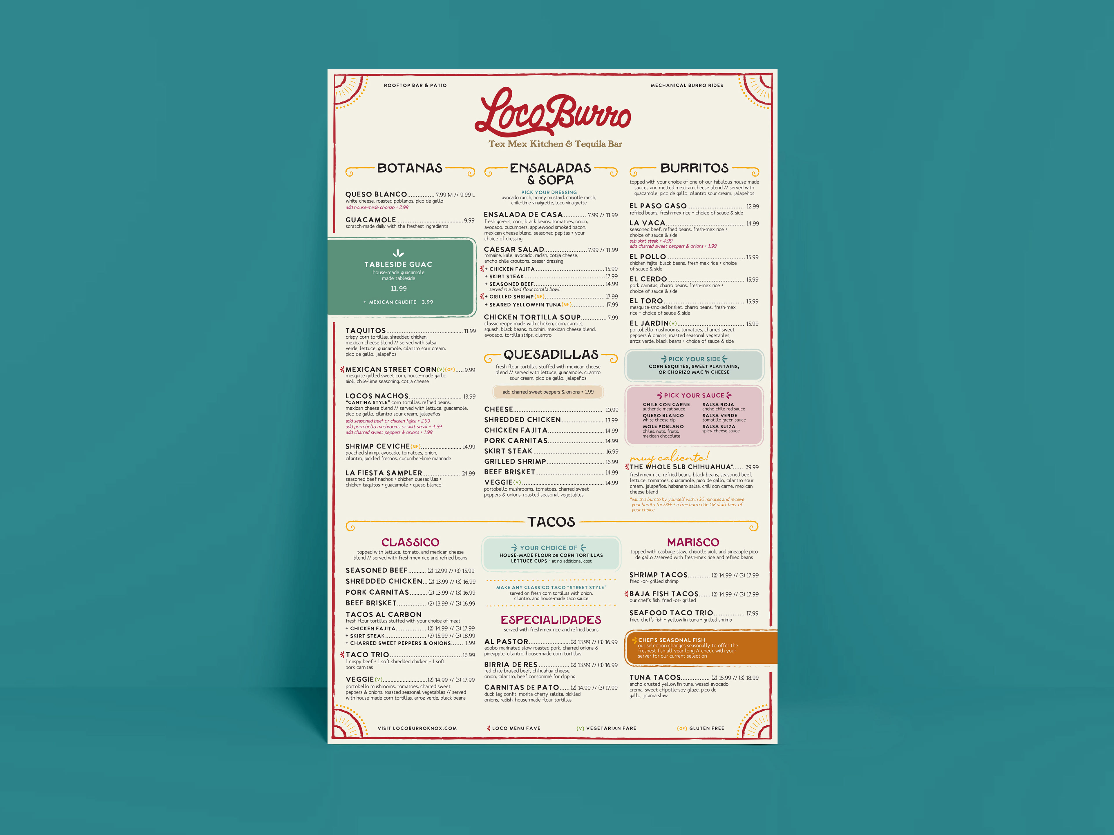
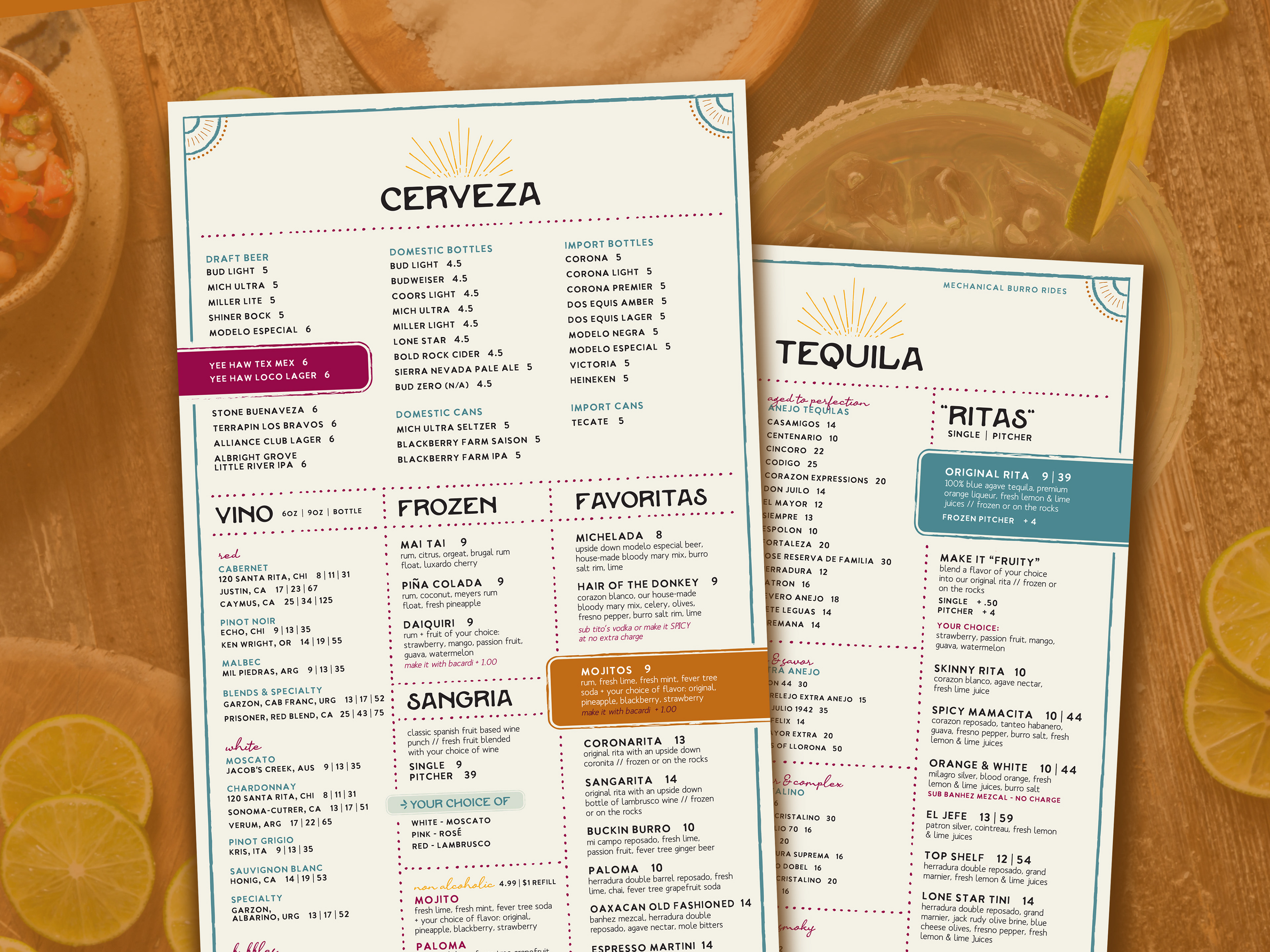
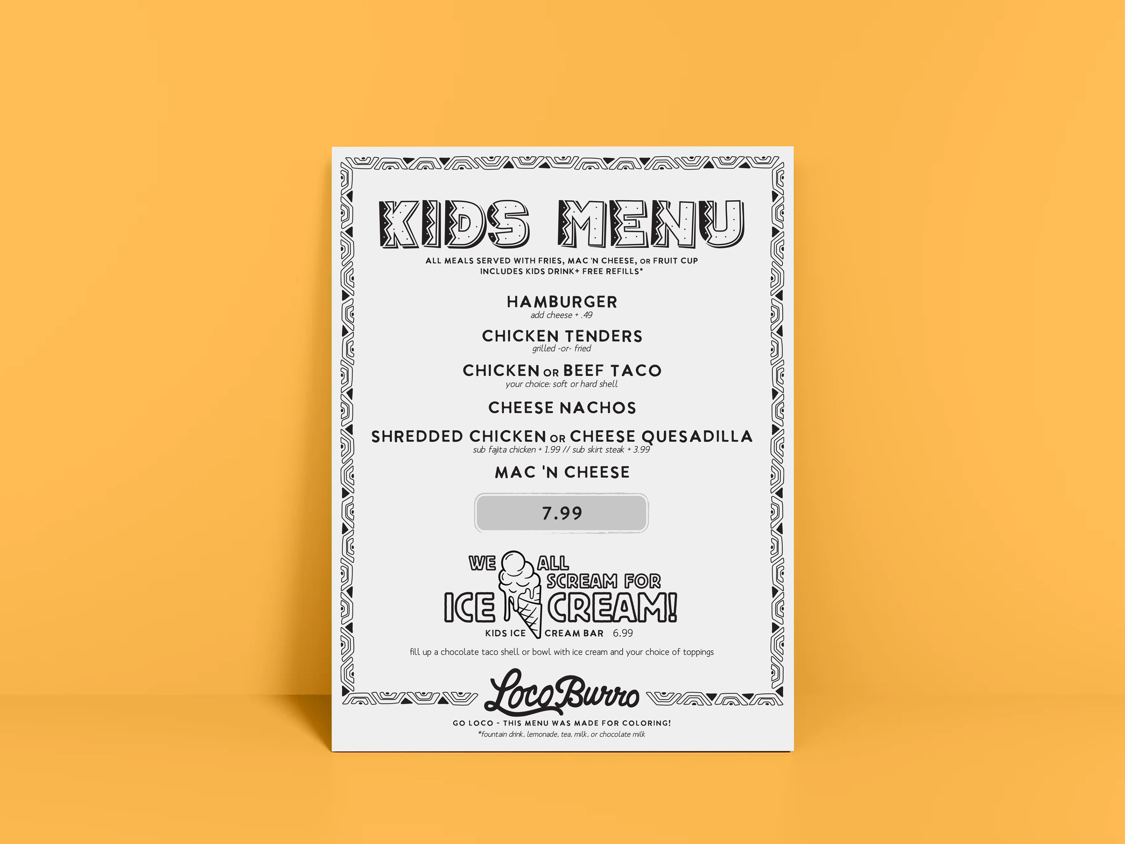
3. Build menus that guide customers clearly through a multitude of offerings without losing the brand’s vibrant energy.
4. Ensure supporting collateral and materials feel cohesive and adaptable.
The Brainstorm
I explored how successful Mexican and Tex‑Mex brands use color, typography, and pattern to create energy and appetite appeal. Authenticity was key, so we focused on a colorful palette and graphic system that felt lively and genuine, while working across both print menus and environmental signage.
The Work
Exploration: I kicked things off with sketches and rough mockups, testing how bold type, playful shapes, and vibrant colors could come together without overwhelming the design.
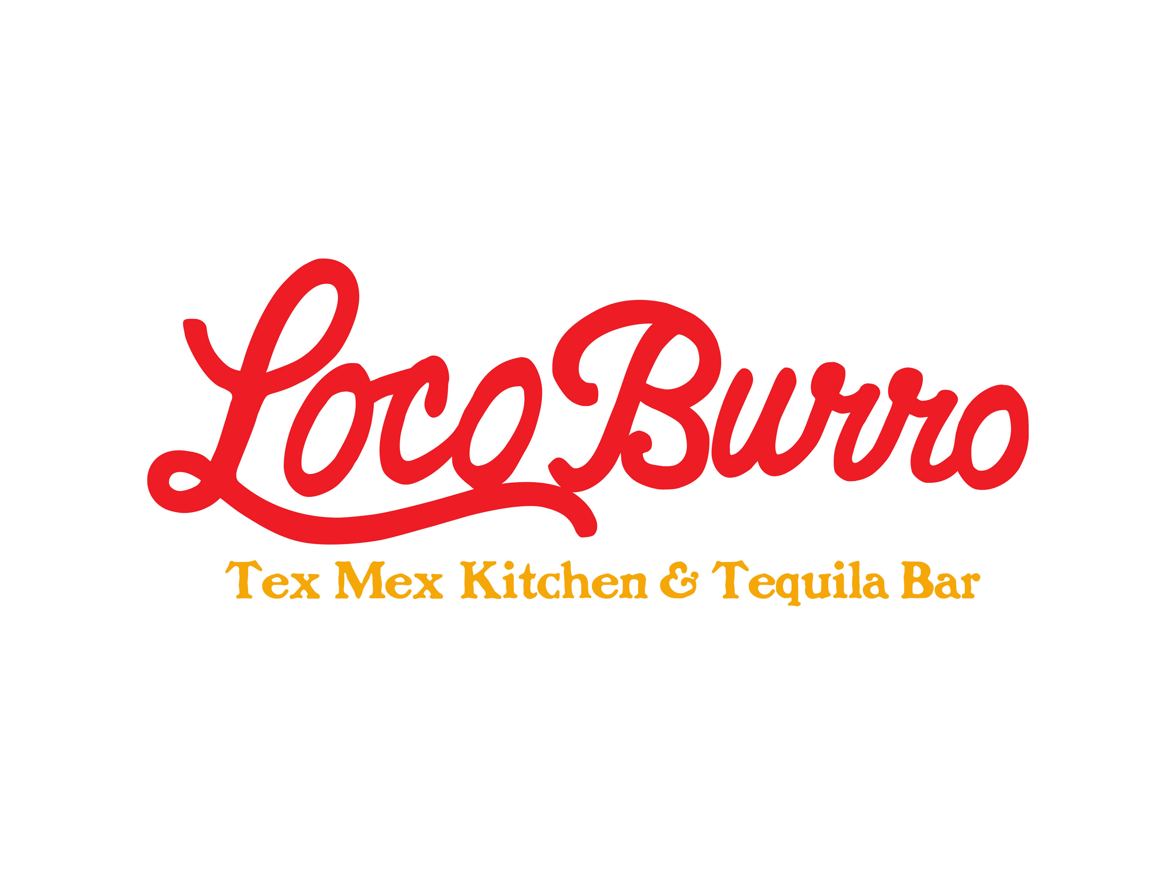
Logo Development: Multiple directions explored everything from hand‑drawn hooks to cleaner typographic systems. We landed on a mark that’s confident, rustic, and flexible enough to live on menus, signage, and merch.
Menu & Collateral: Menus were designed for readability, with clear item hierarchy and bold accents that echo the brand’s vibrant palette. Collateral elements incorporate texture and pattern to add personality. Client check-ins throughout the process helped refine the tone and visuals so everything felt intentional and on-brand.
The Afterglow
Working closely with the client, we delivered a brand that captures the fun, colorful nature of Loco Burro while balancing clarity and structure. When a brand feels alive and authentic, every piece of collateral becomes more memorable. This new identity gave the Knoxville location its own presence in the local scene, ready to resonate with locals and visitors alike.
Some of the work featured on this page was developed while I was employed at Asen Marketing, where I contributed to client projects and brand initiatives as a Senior Designer & Developer.