Dreamland BBQ is a beloved Southern barbecue institution that’s been serving its iconic hickory-smoked ribs since 1958, growing from its Tuscaloosa roots into multiple locations across the Southeast.
This project reimagines the Dreamland identity as a fast-casual BBQ restaurant with updated visuals and expanded concept work that honors its rich heritage while giving the brand fresh creative energy. The work includes logo exploration, brand system updates, and concept pieces that could live across menus, signage, and brand collateral.

The Challenge
The challenge was to reimagine Dreamland BBQ for a fast-casual market. This exploration asked a simple but nuanced question: How might a beloved, heritage-driven barbecue brand evolve visually without losing the grit, soul, and authenticity that define it?
The updated direction needed to feel approachable and efficient for a modern dining experience, while still honoring Dreamland’s deep Southern roots and no-frills BBQ culture.
The Game Plan
1. Explore a refined visual identity rooted in Dreamland’s heritage but made for the fast-casual style.
2. Develop a logo and typographic system that feels bold, enduring, and recognizable.
3. Position the brand for a potential transition into the fast-casual market without losing its authenticity.
4. Create a cohesive visual system that scales across signage, packaging, merchandise, and digital touch points.
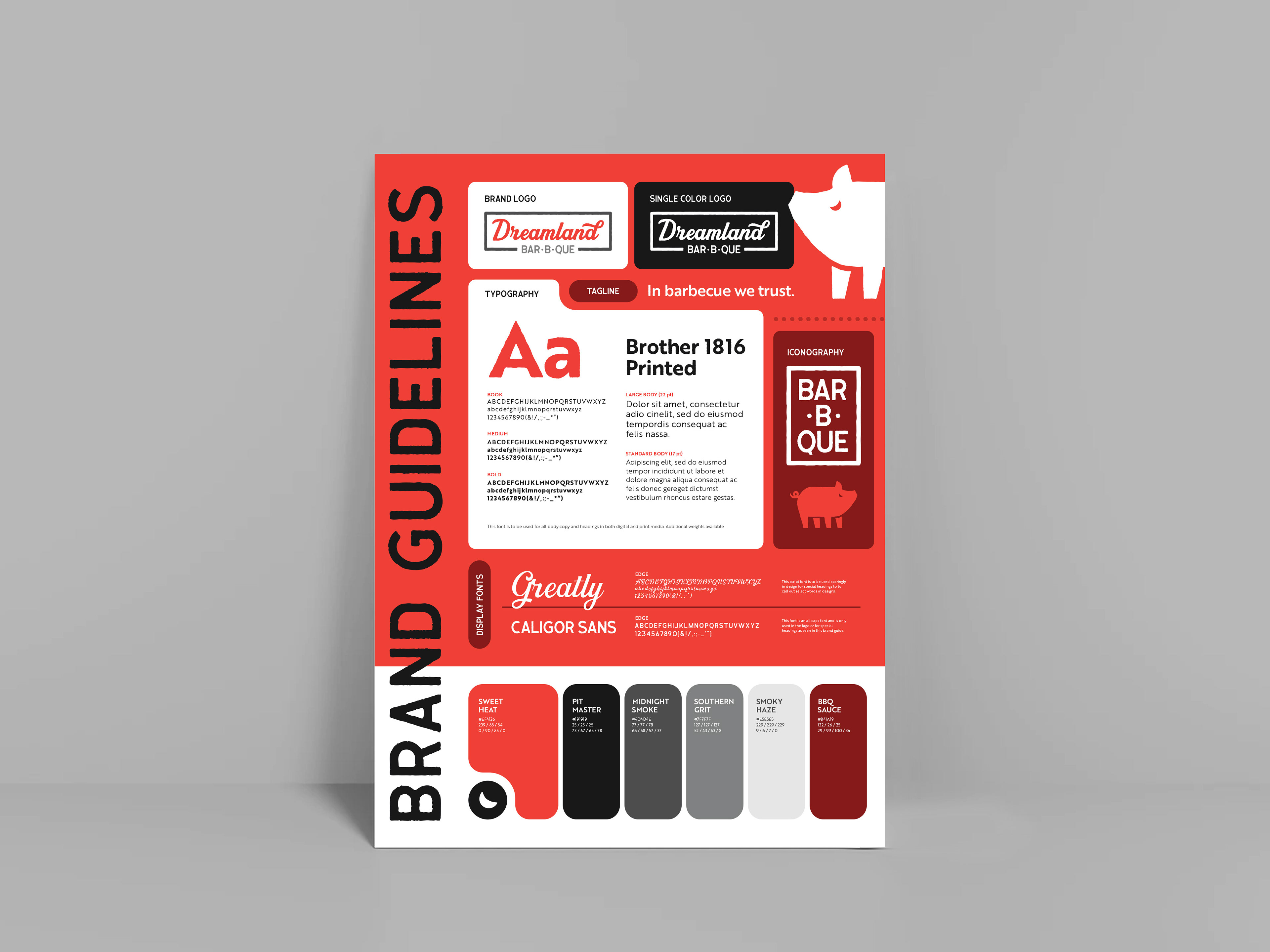
The Work
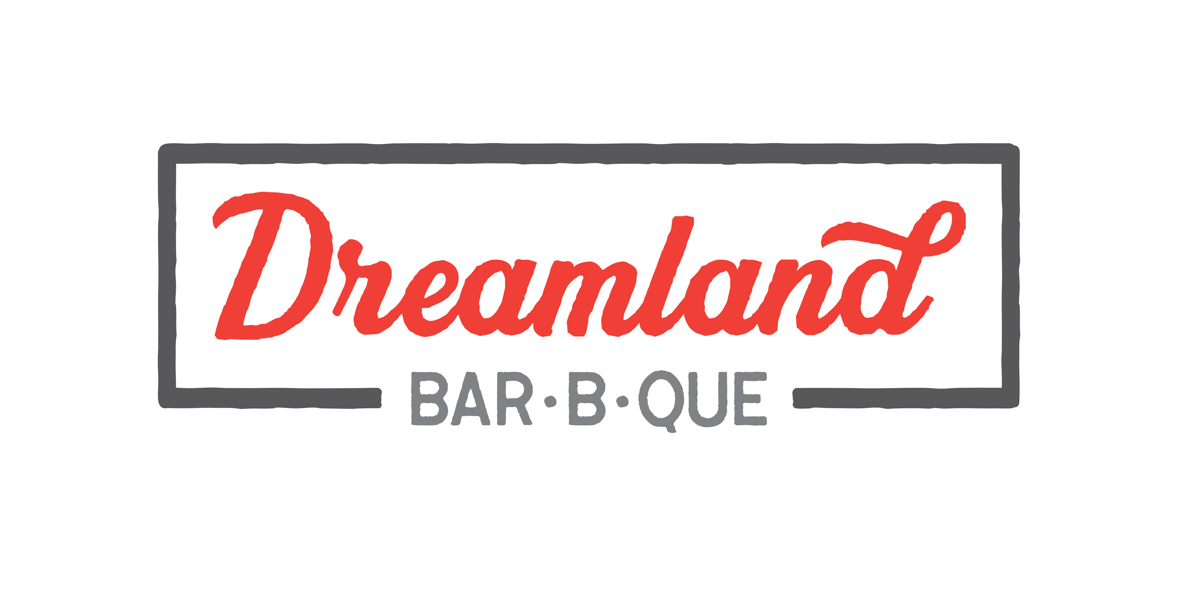
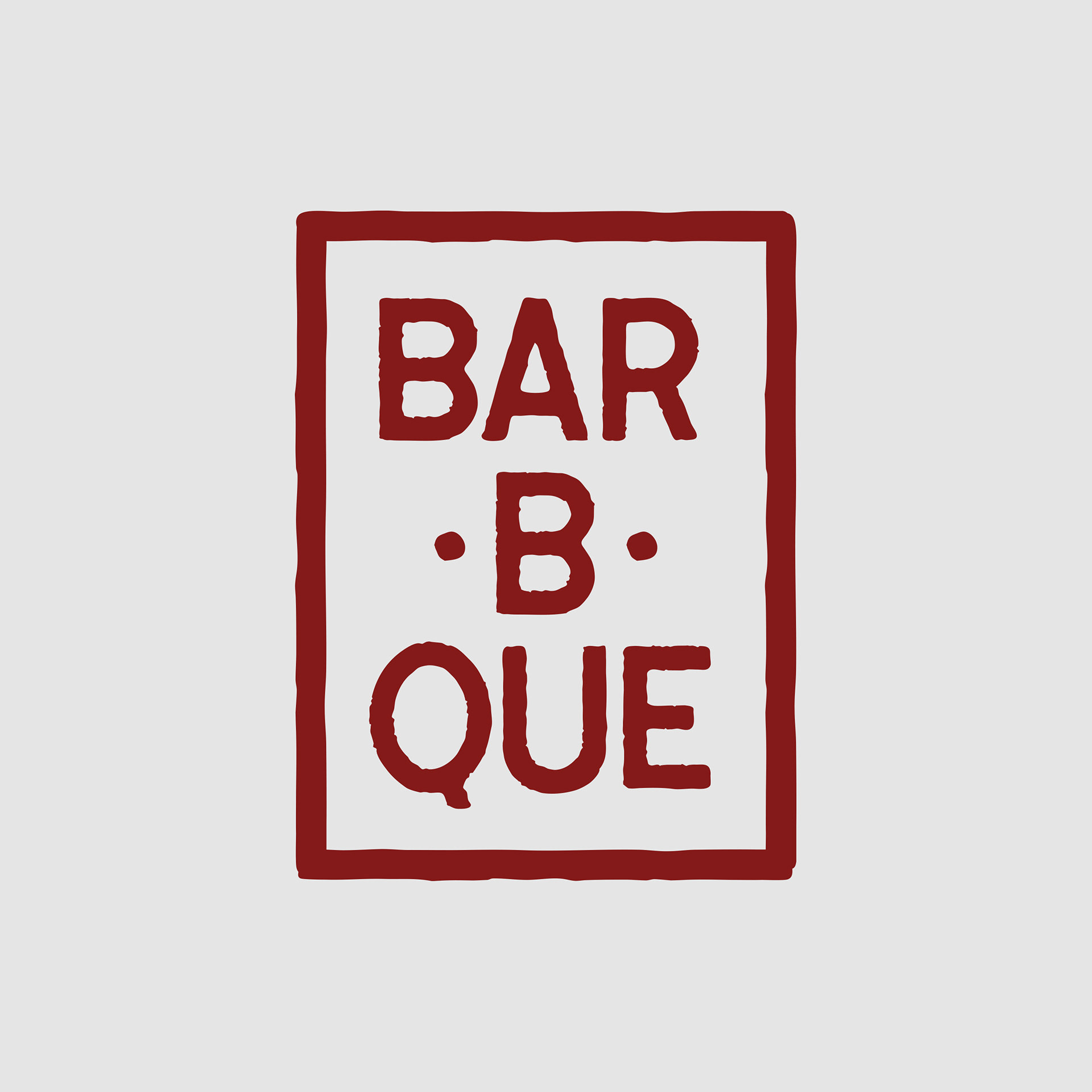
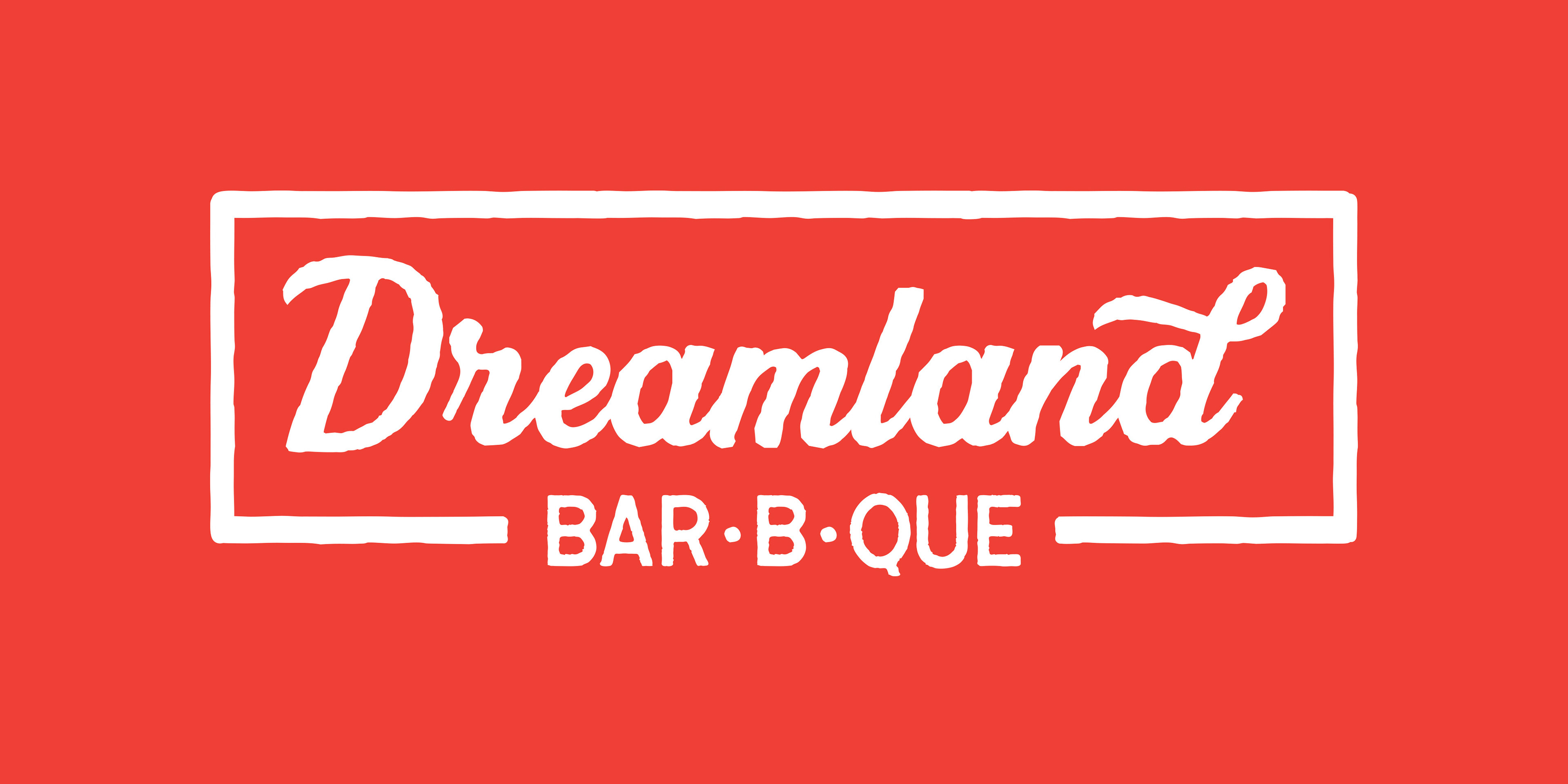
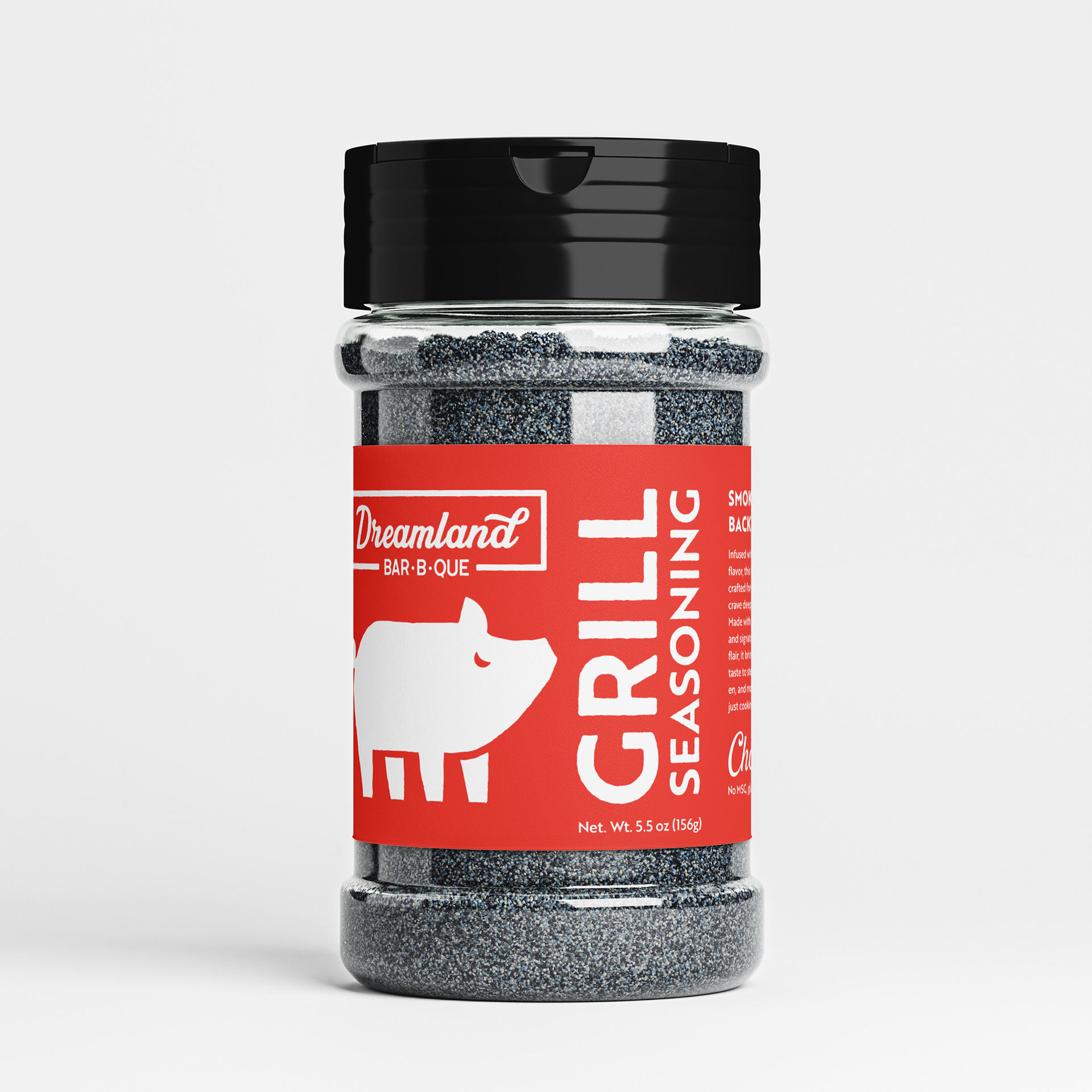
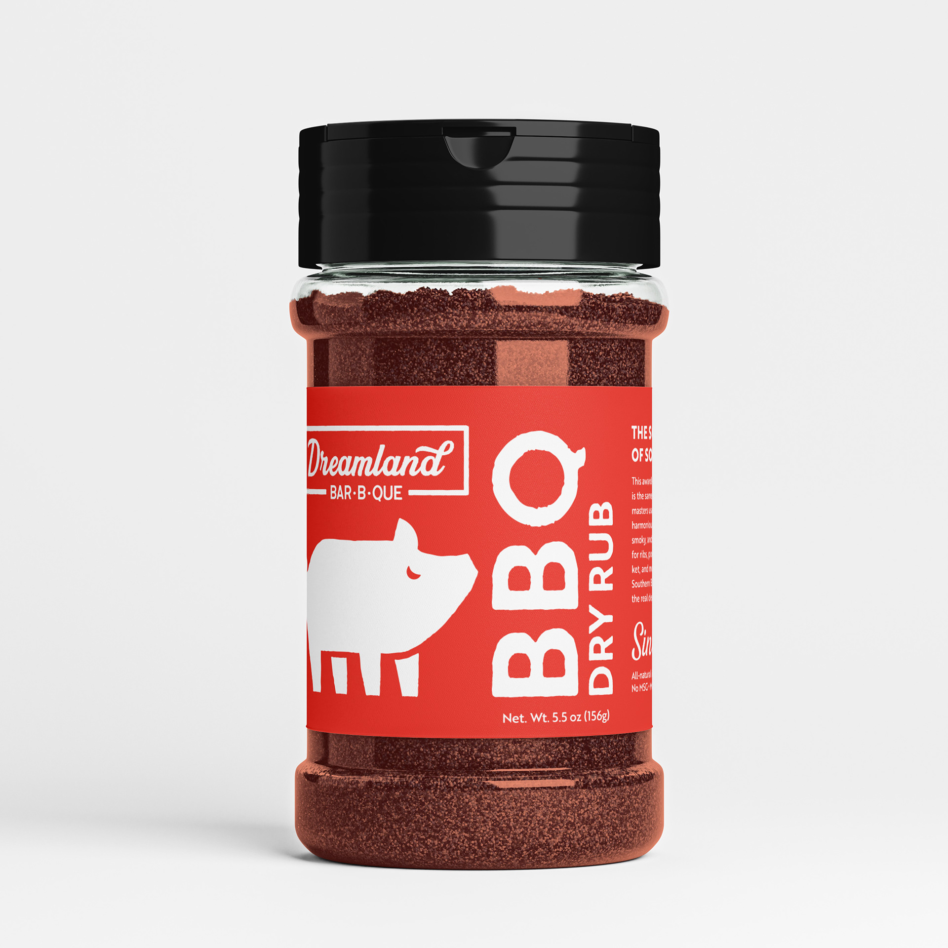
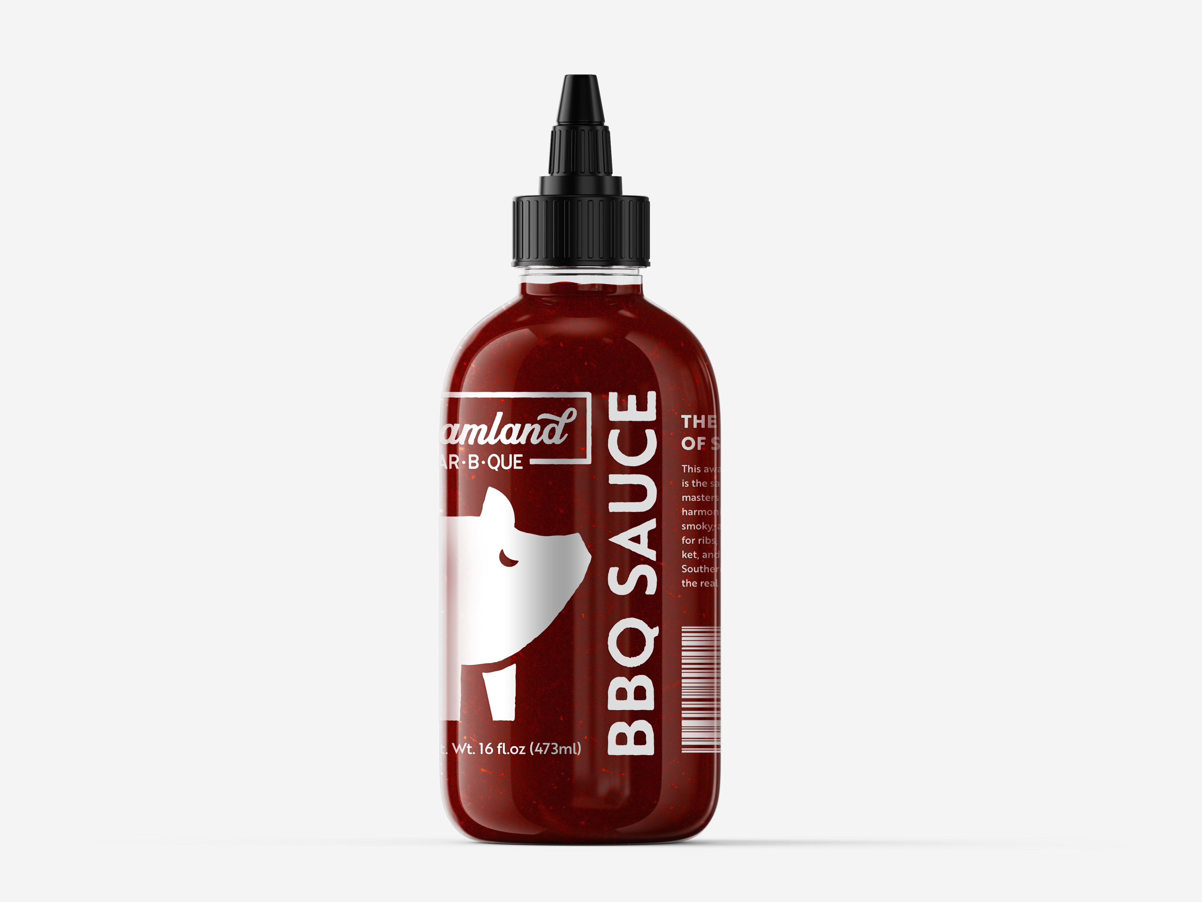
Logo & Visual Identity: The chosen direction leans into bold, confident typographic presence and custom iconography that suggests that blends classic BBQ iconography with a twist to bring in their namesake. This identity aims for a universal appeal that still feels unmistakably Southern and rooted in tradition.
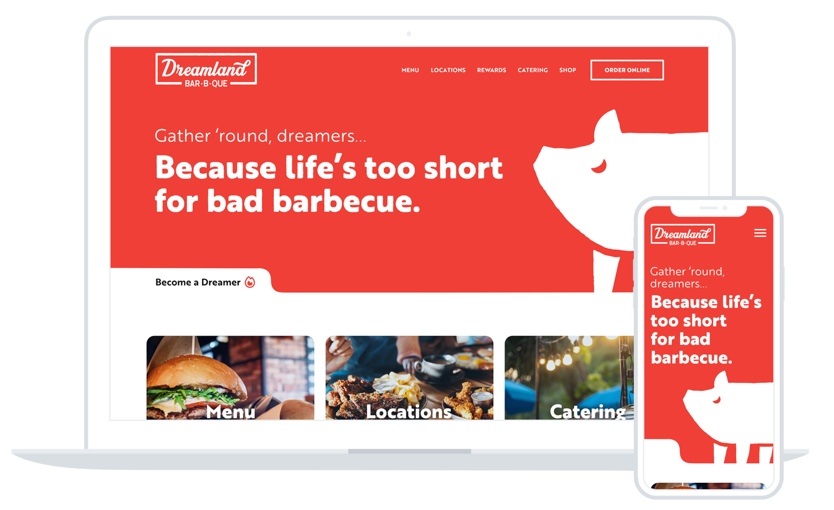
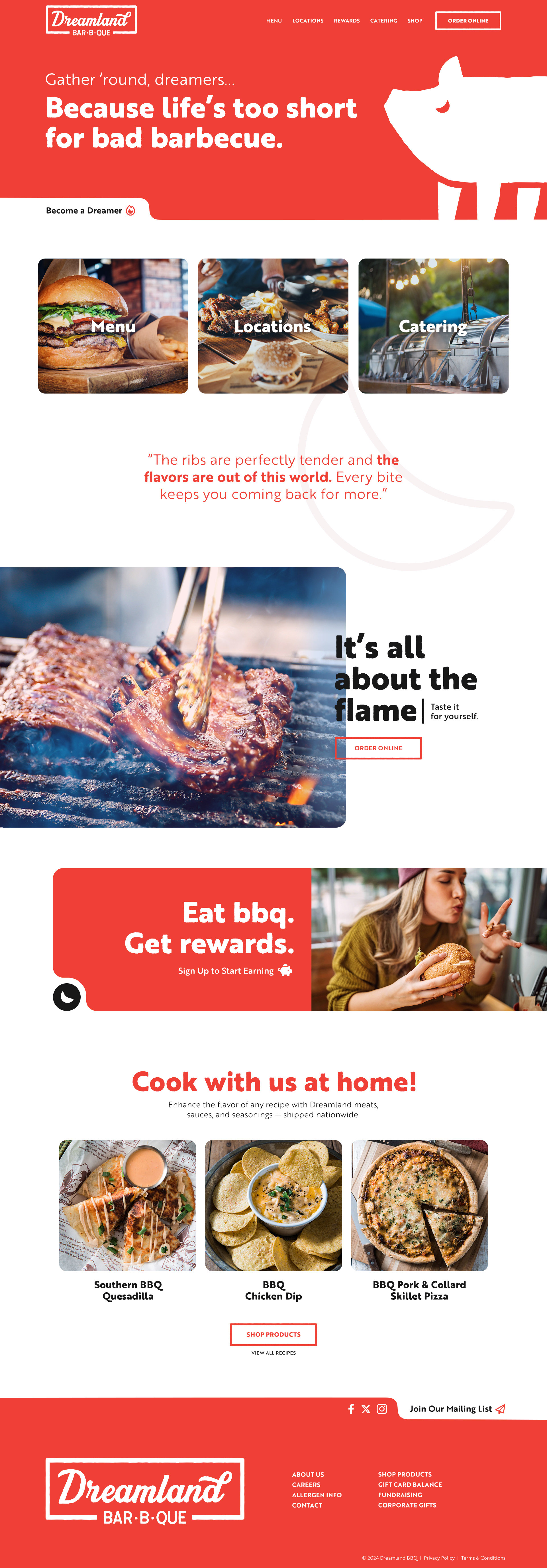
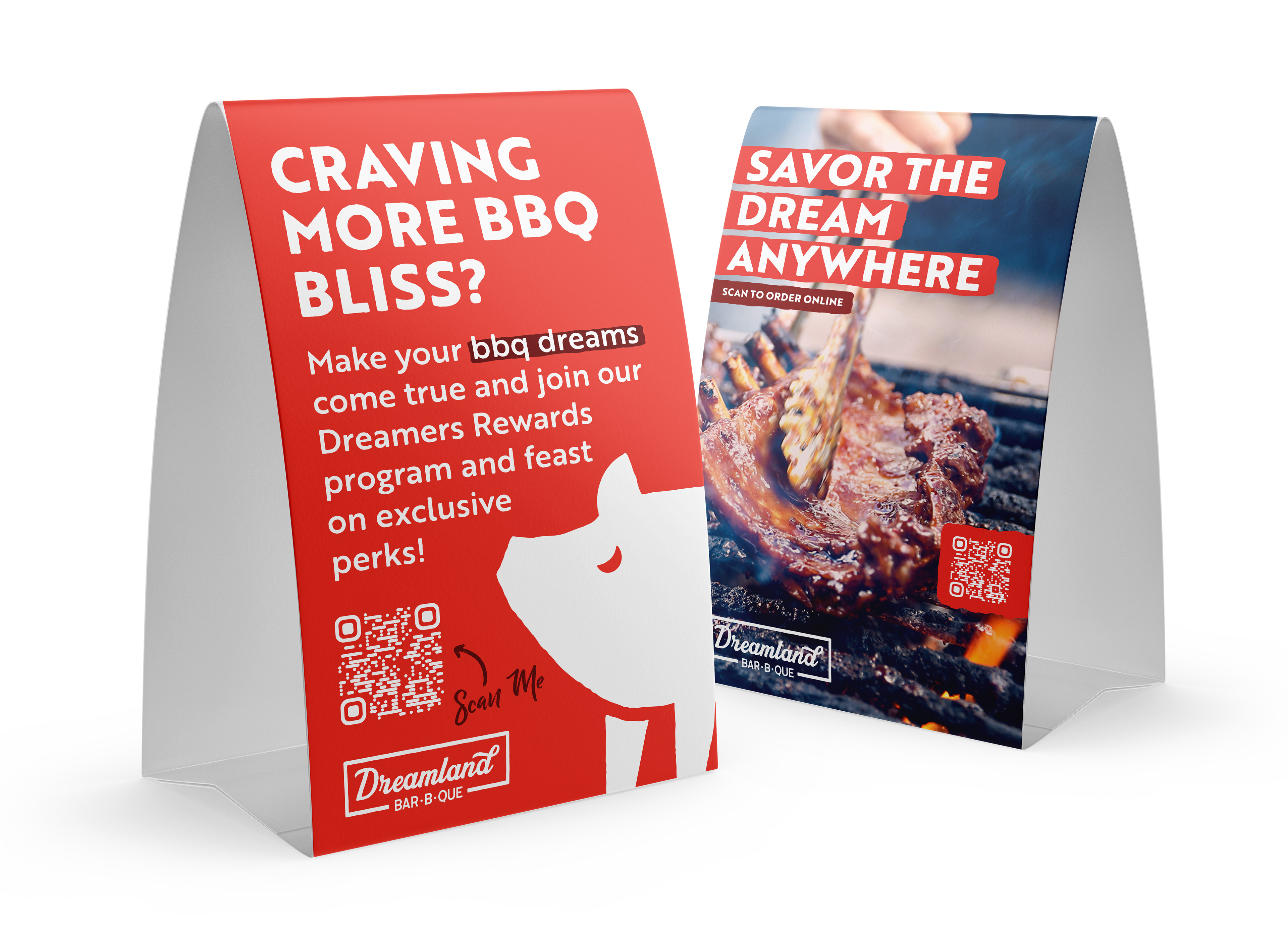
Brand Extensions: I developed supporting graphics and brand applications — from potential website designs to collateral and packaging explorations — that extend the identity system in ways that feel cohesive and flexible.
The Afterglow
While this is conceptual work, the reimagined Dreamland BBQ identity demonstrates how a storied brand can be visually refreshed without losing its soul. The result creates a visual voice that feels right for the present and flexible enough for real use across packaging, space design, and digital environments.
This project reinforced the importance of balancing heart with strategy — especially for legacy brands with devoted followings. A refreshed identity doesn’t mean rewriting history; it means making it feel relevant again. Thoughtful typography, purposeful color, and a clear visual system can honor what’s loved about a brand while giving it room to grow in a new fast-casual market.
Some of the work featured on this page was developed while I was employed at Asen Marketing, where I contributed to client projects and brand initiatives as a Senior Designer & Developer.