Bloom Baby Organics is a concept brand for a line of all-natural baby care products that feel as gentle and wholesome as the name suggests. The goal was to create an identity that communicates trust, nurture, and vibrancy without resorting to the usual pastel clichés.
I developed the brand identity, logo, and packaging design, creating a system that feels warm, modern, and ready to live on shelves, in nurseries, and in digital environments.
The Challenge
The baby product space is rich with soft colors and sweet motifs — but that also means it’s easy for brands to blend together. The design challenge was clear: build a look that feels gentle and trustworthy while also standing out with personality and warmth. Packaging needed to feel premium yet approachable, and the identity needed to speak to parents who care about quality ingredients and thoughtful design.
The Game Plan
1. Create a brand identity that feels warm, modern, and nurturing without feeling cliché.
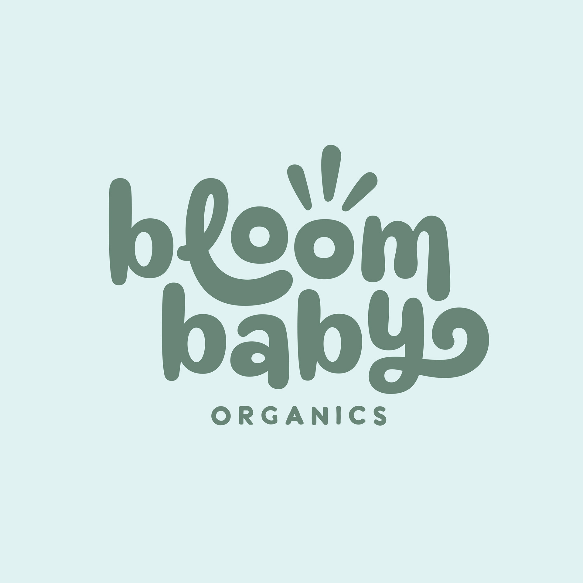
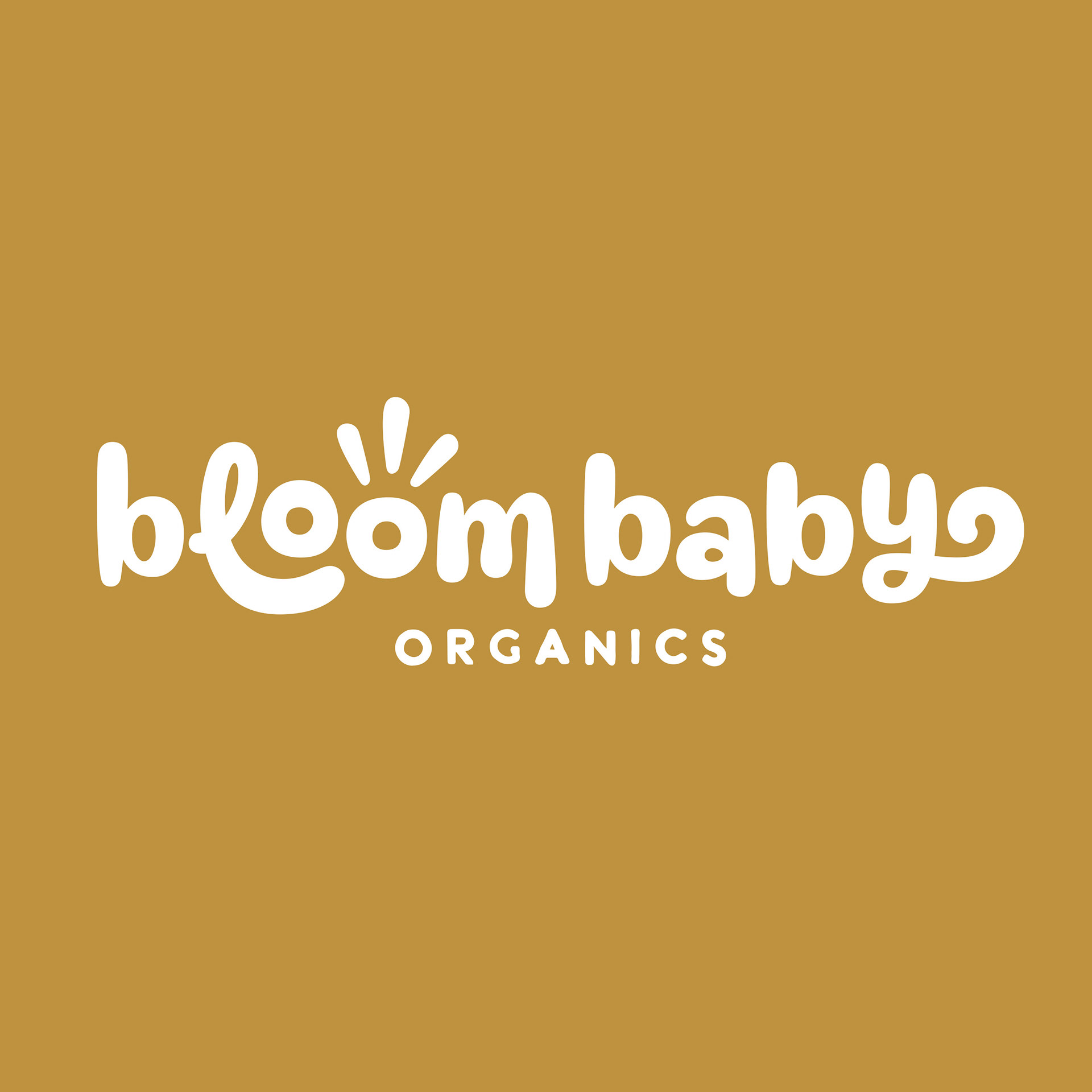
2. Develop a logo system that’s simple, friendly, and adaptable.
3. Design packaging that stands out on shelf while feeling trustworthy and gentle.
4. Build supporting visuals that work across digital and physical touch points.
The Work
Exploration: I started with sketches and mood boards to explore how shape and color can communicate gentle care without defaulting to baby-brand stereotypes. This phase helped narrow in on a visual direction that felt bright but grounded.
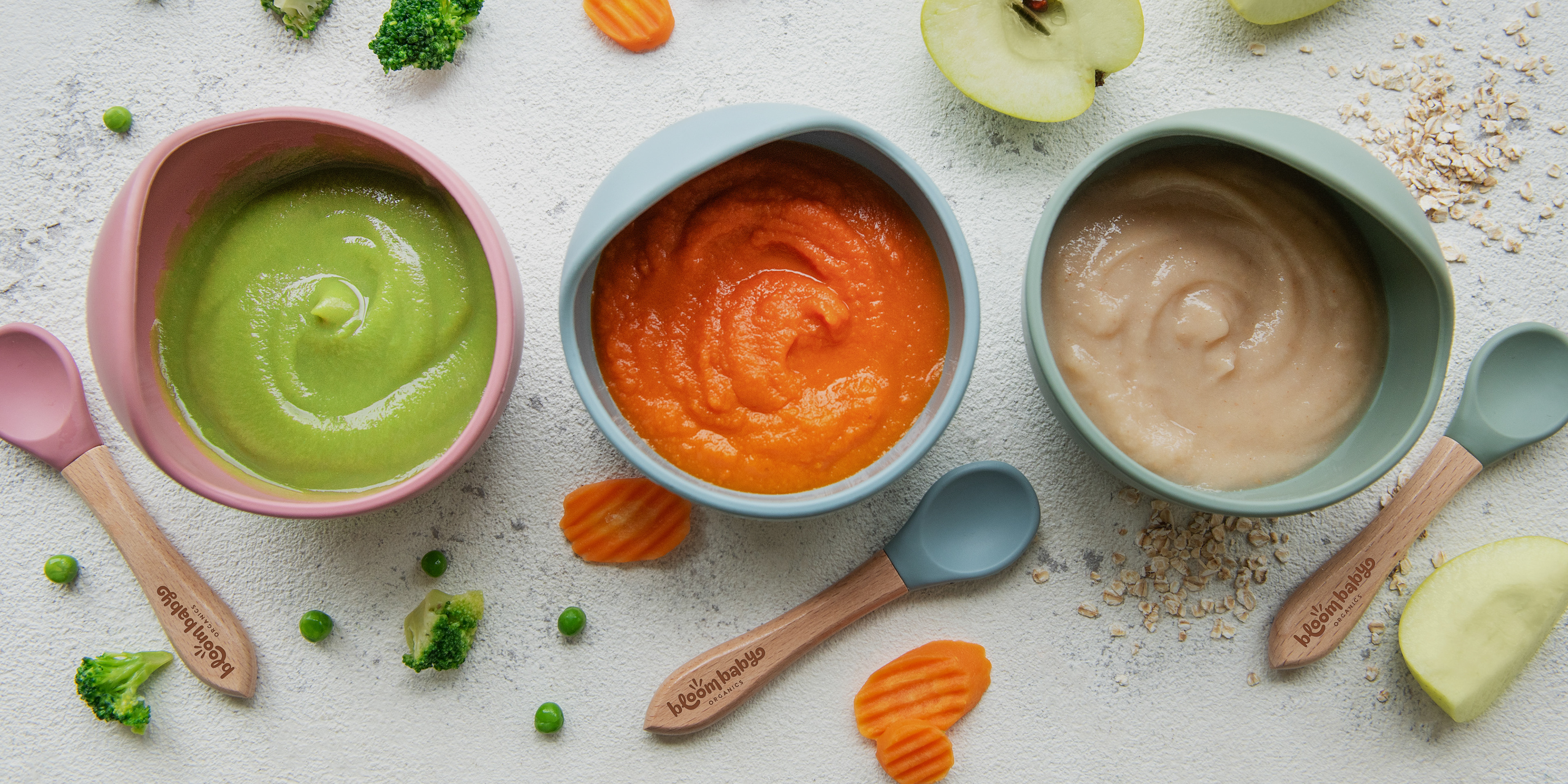
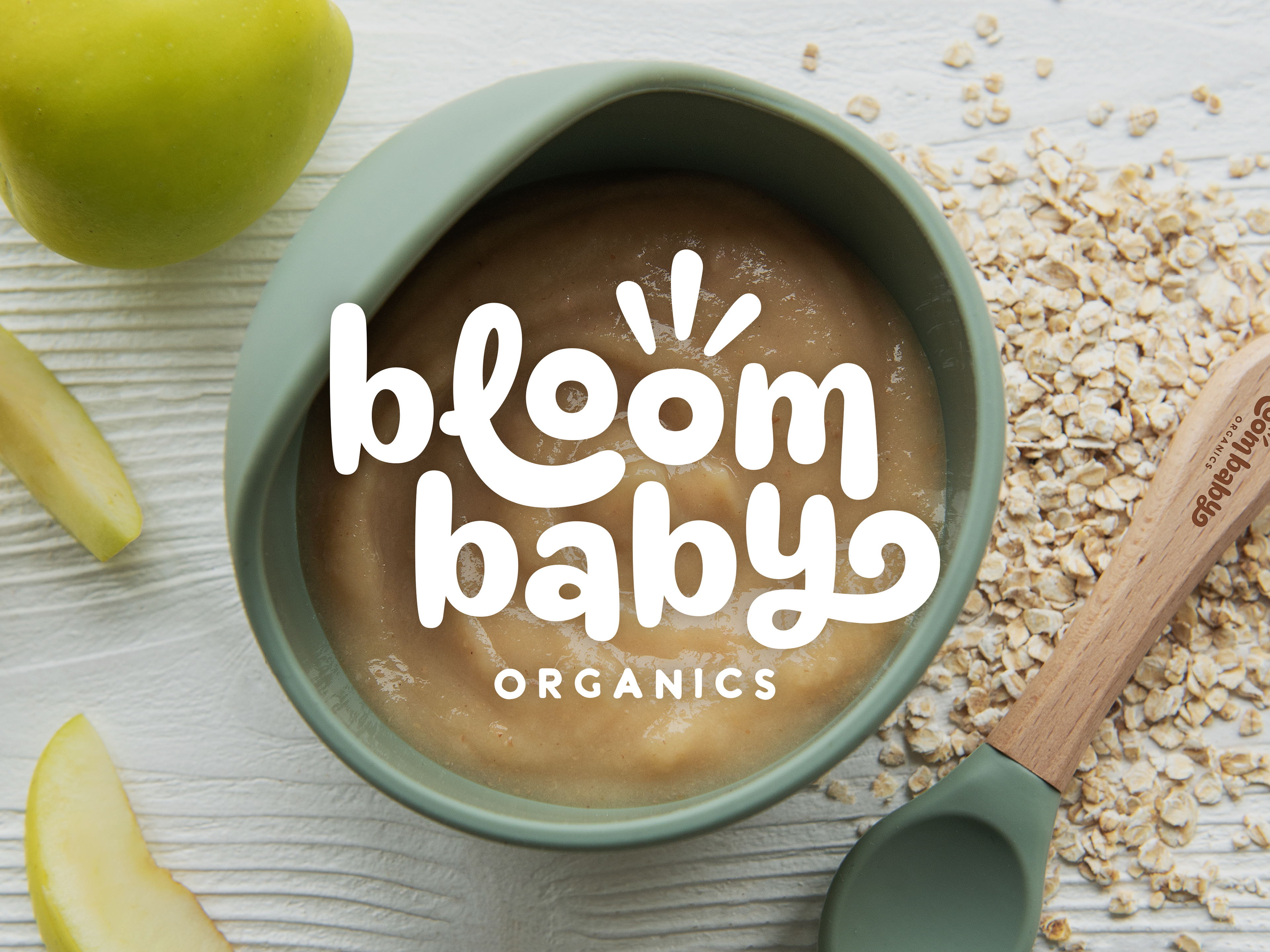
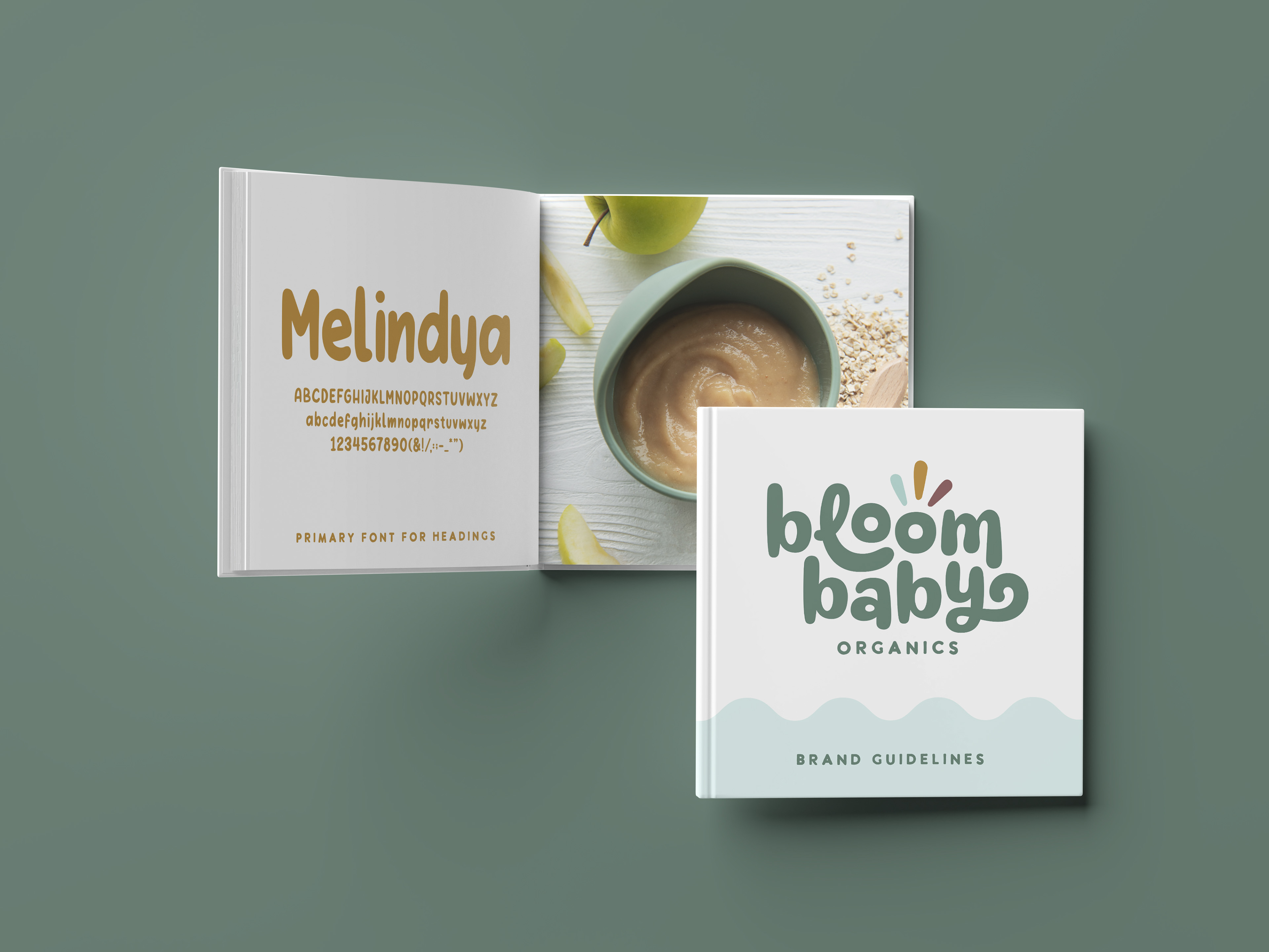
Logo Development: Several directions leaned into botanicals and soft curves, eventually landing on a mark that’s clean, approachable, and full of subtle personality. The chosen logo feels friendly and flexible — perfect for labels, web, and collateral.
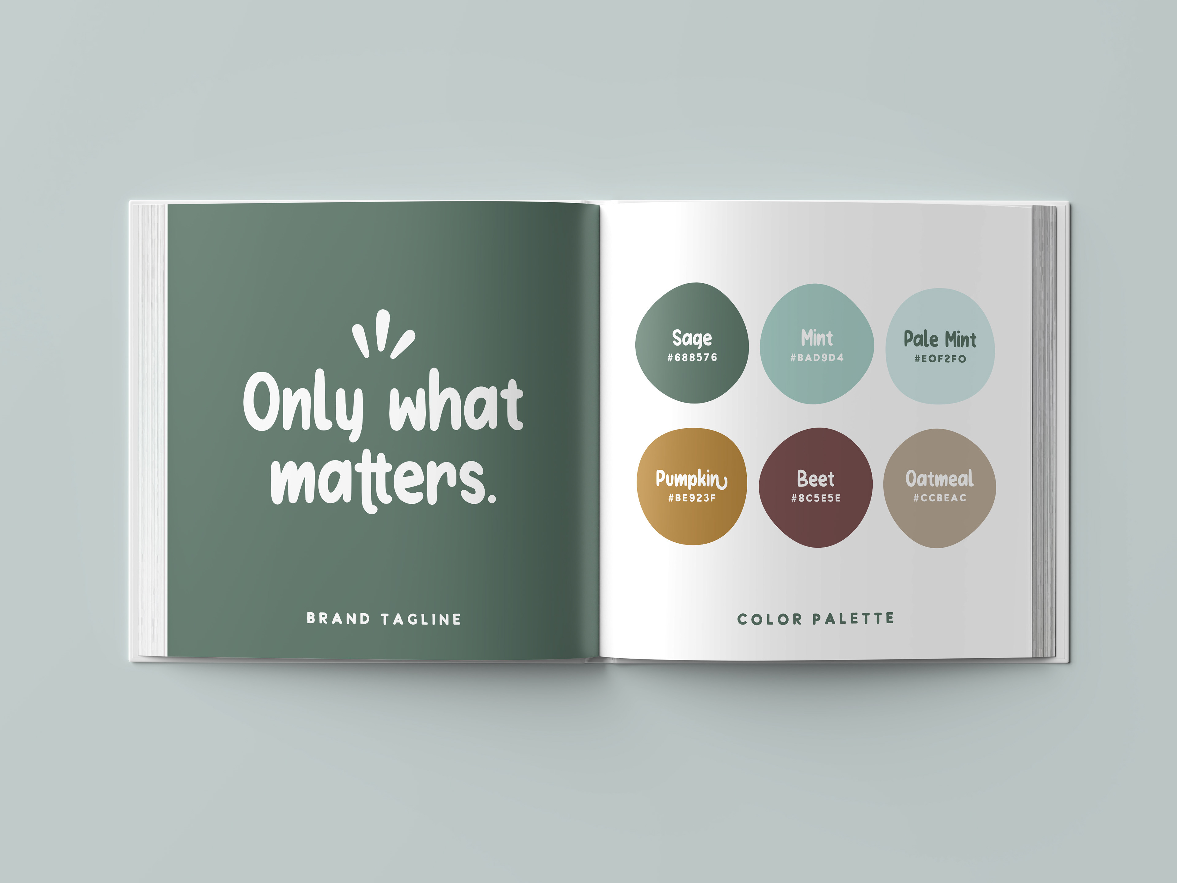
Packaging Design: Labels were crafted to feel calm and confident with clear hierarchy, soft organic shapes, and a color palette that’s lively without being sugary sweet. I paired expressive color with simple, modern typography to highlight product ingredients and benefits in a way that feels trusted, not cluttered.
Brand System: Beyond the product packaging, supporting graphic elements and patterns were developed to create cohesion across touch points — from secondary packaging to digital assets.
The Afterglow
This project demonstrates a full end-to-end brand build, from strategic positioning to packaging execution. It highlights my ability to design for emotionally driven categories while maintaining clarity, consistency, and real-world usability.